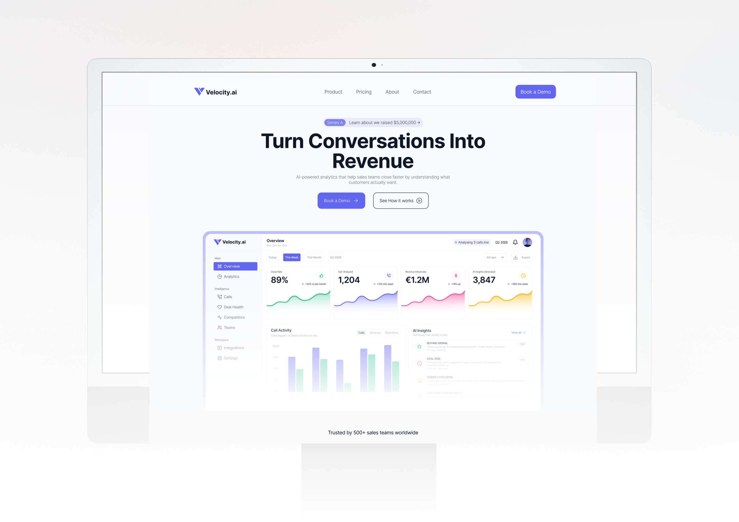
SaaS Startup
Velocity.ai - From Zero to Launch
A Series A startup needed a website fast without compromising on quality. We delivered a full custom prototype in 10 days, on time and on budget.
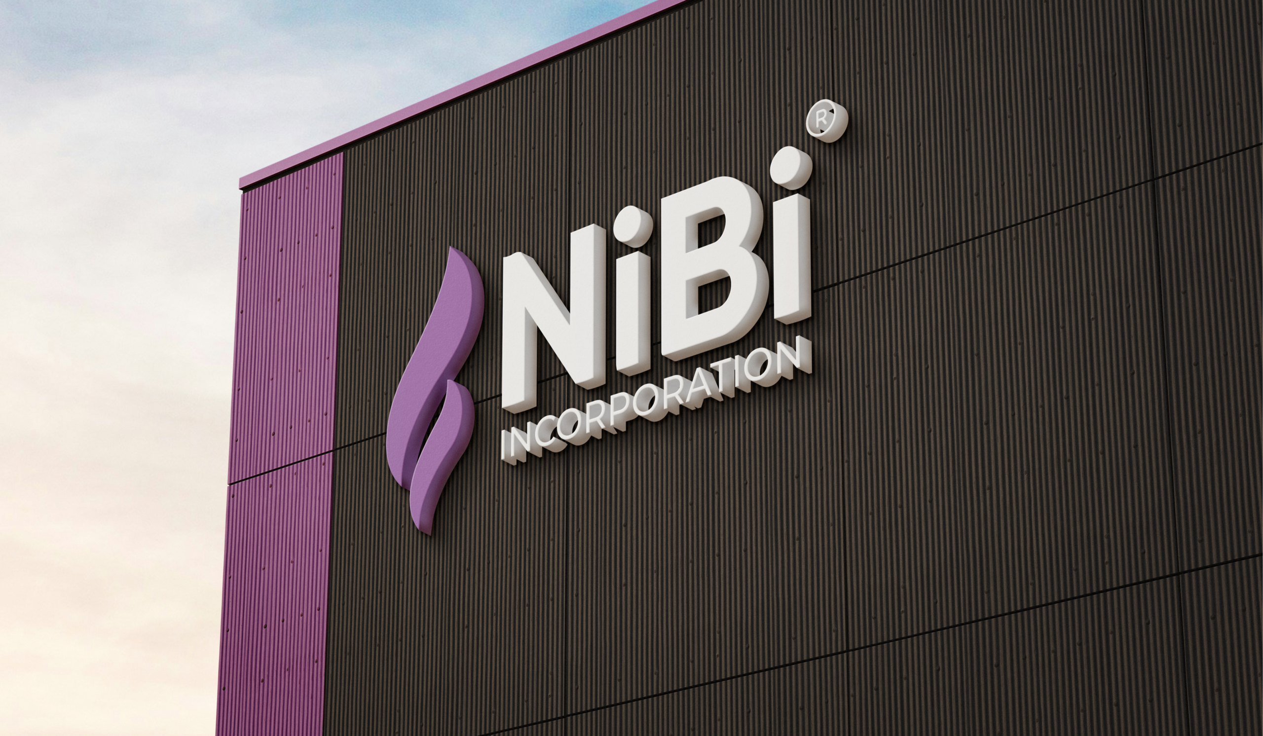
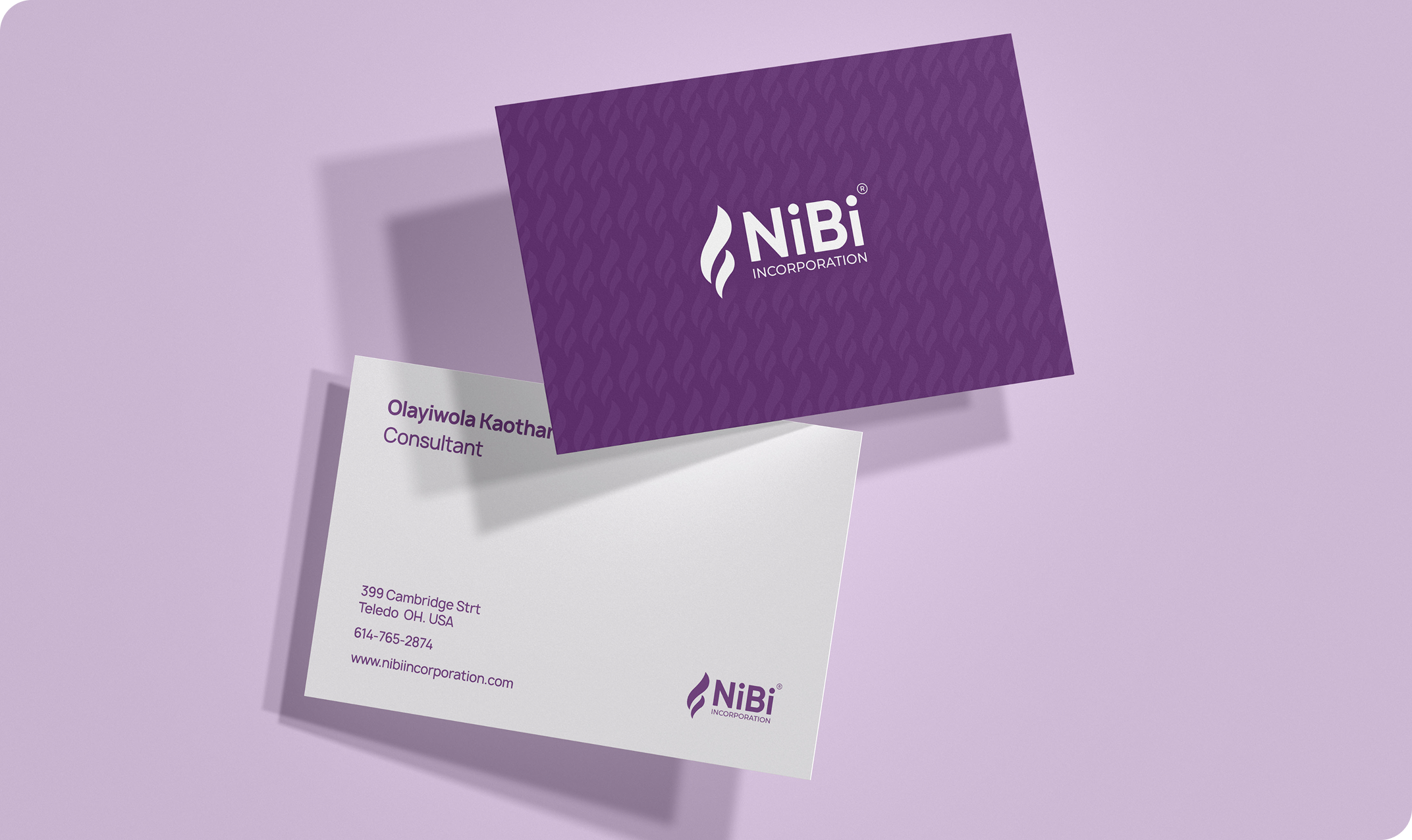
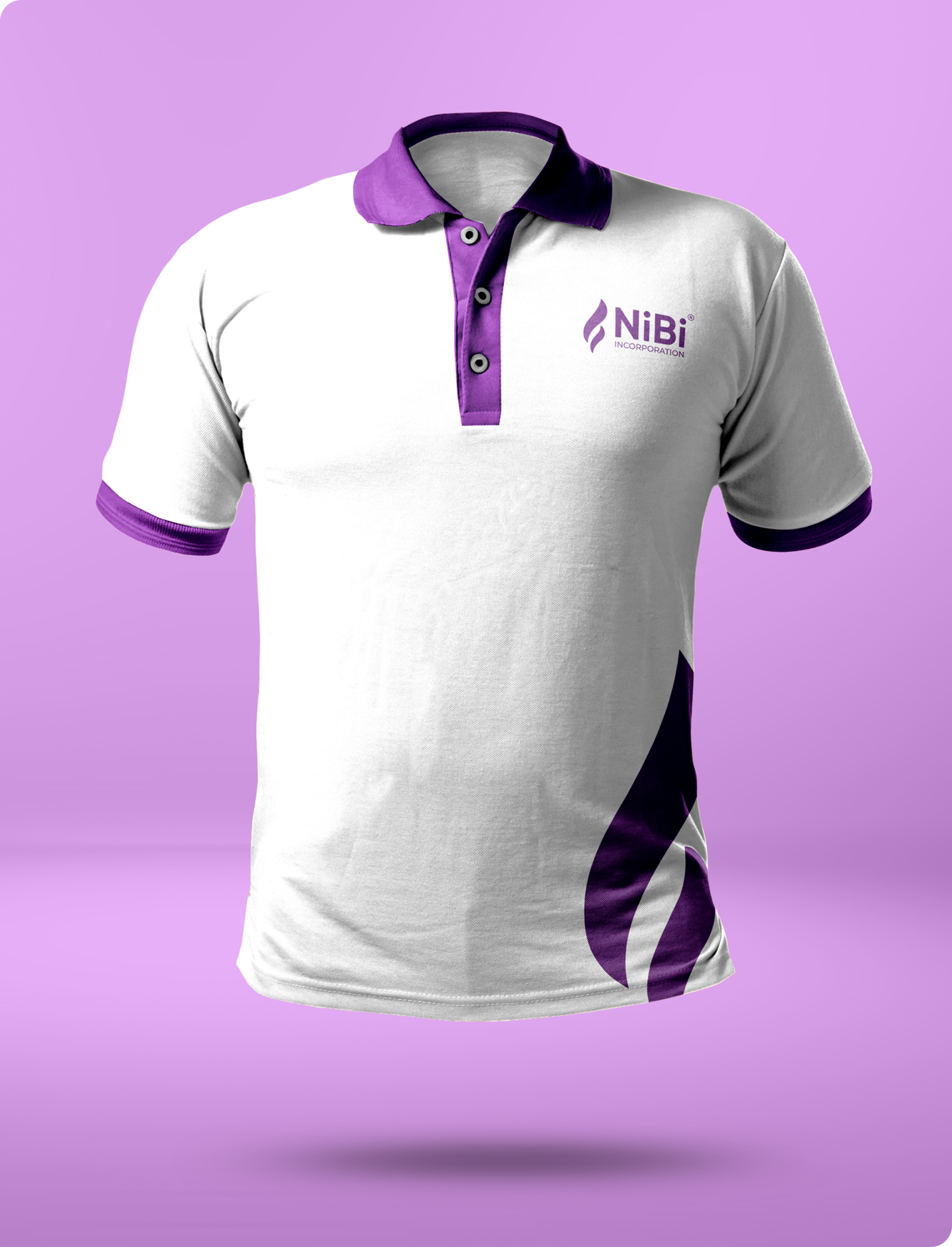
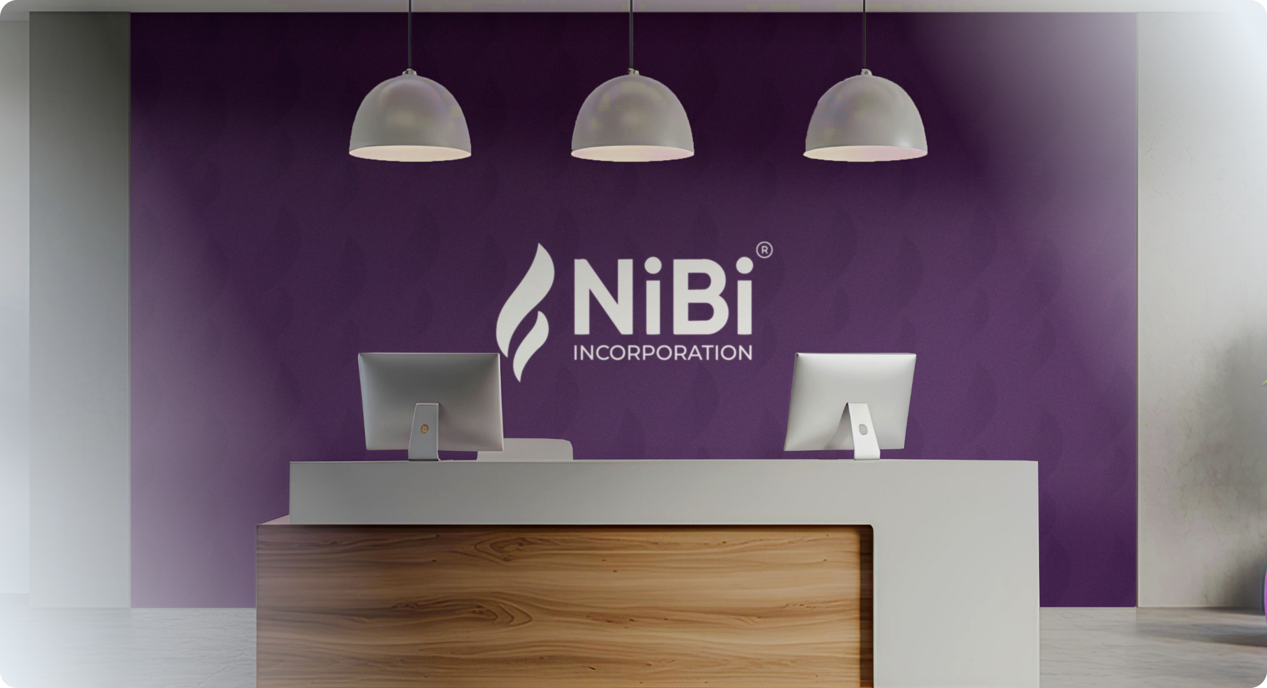
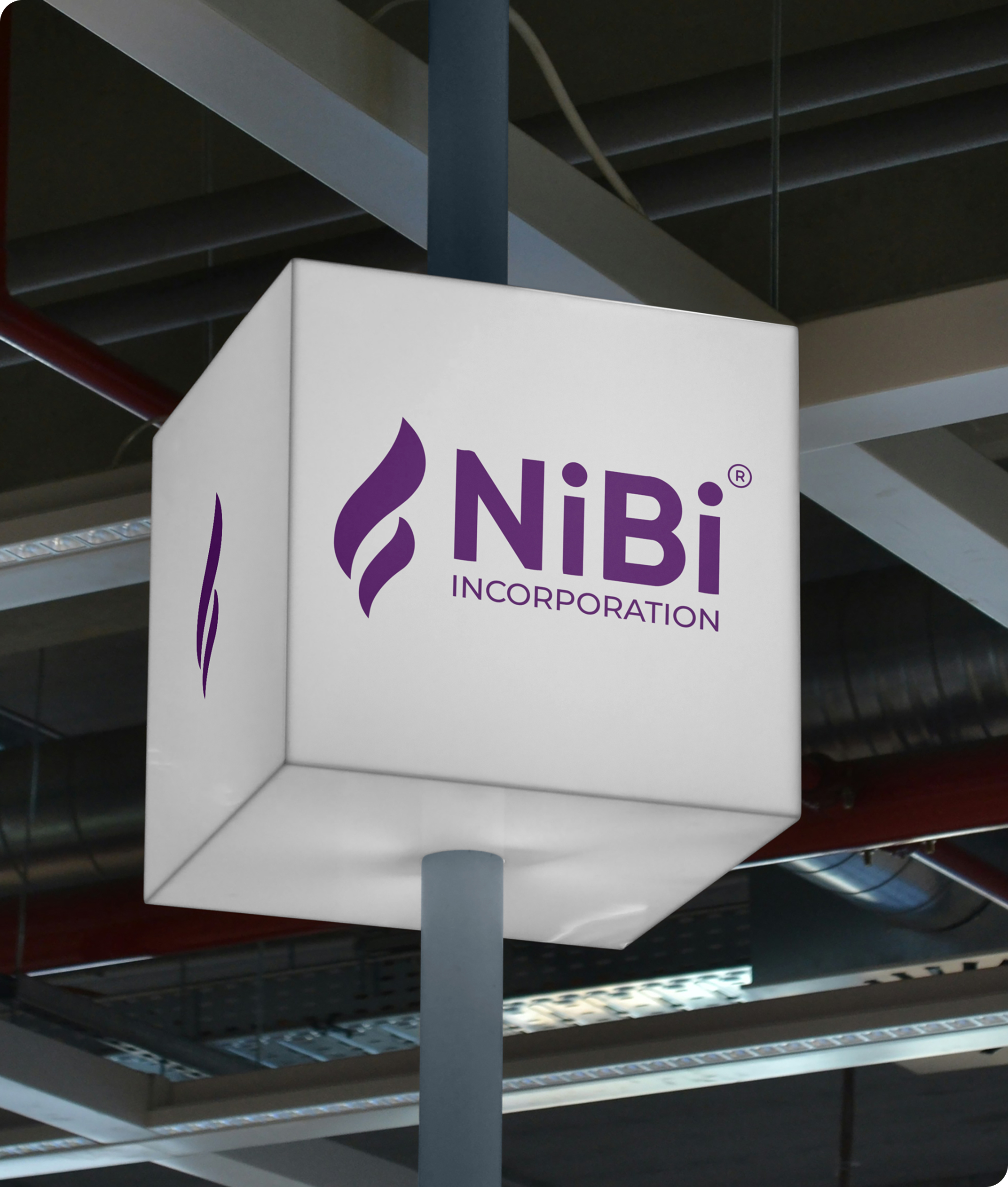
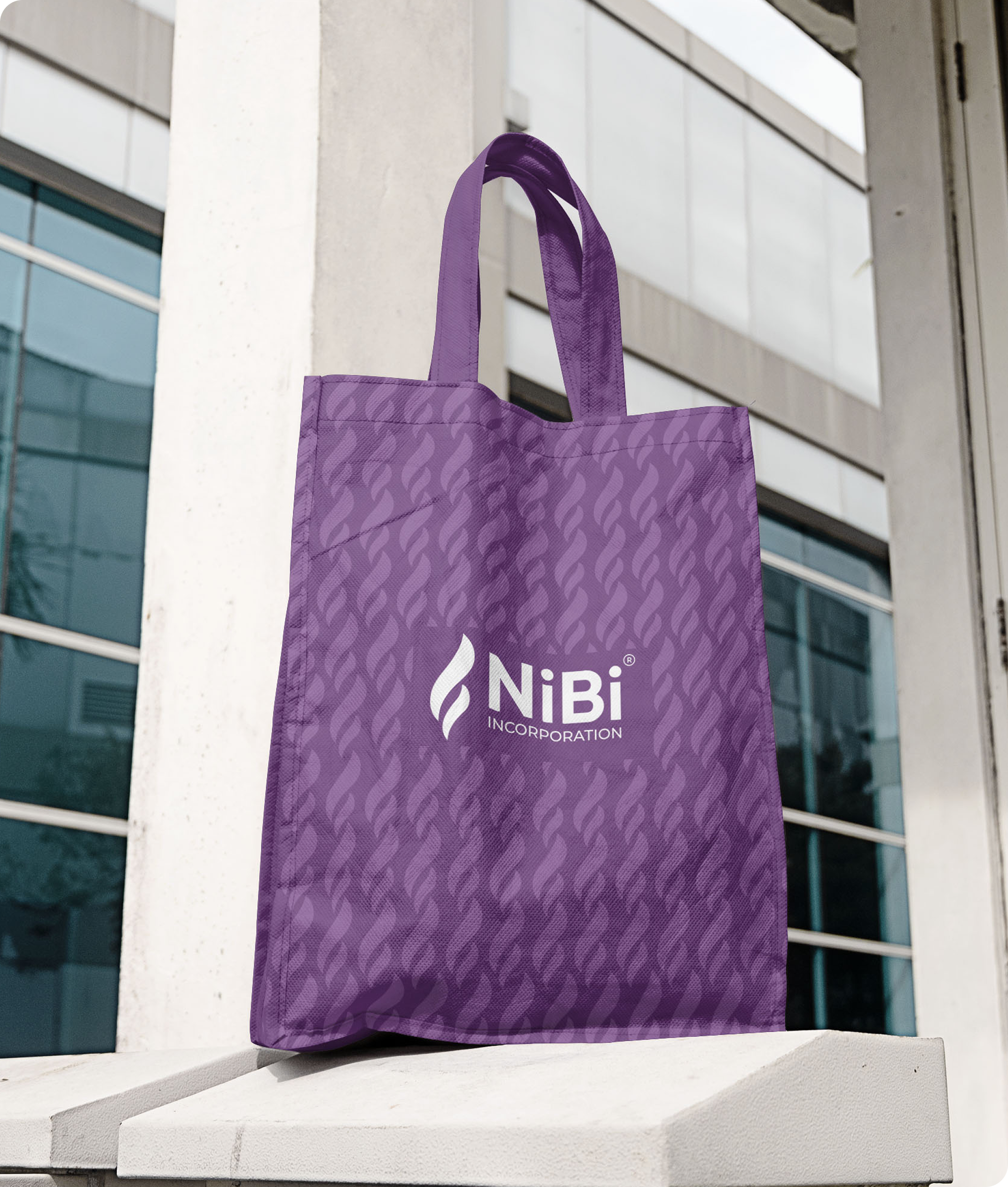
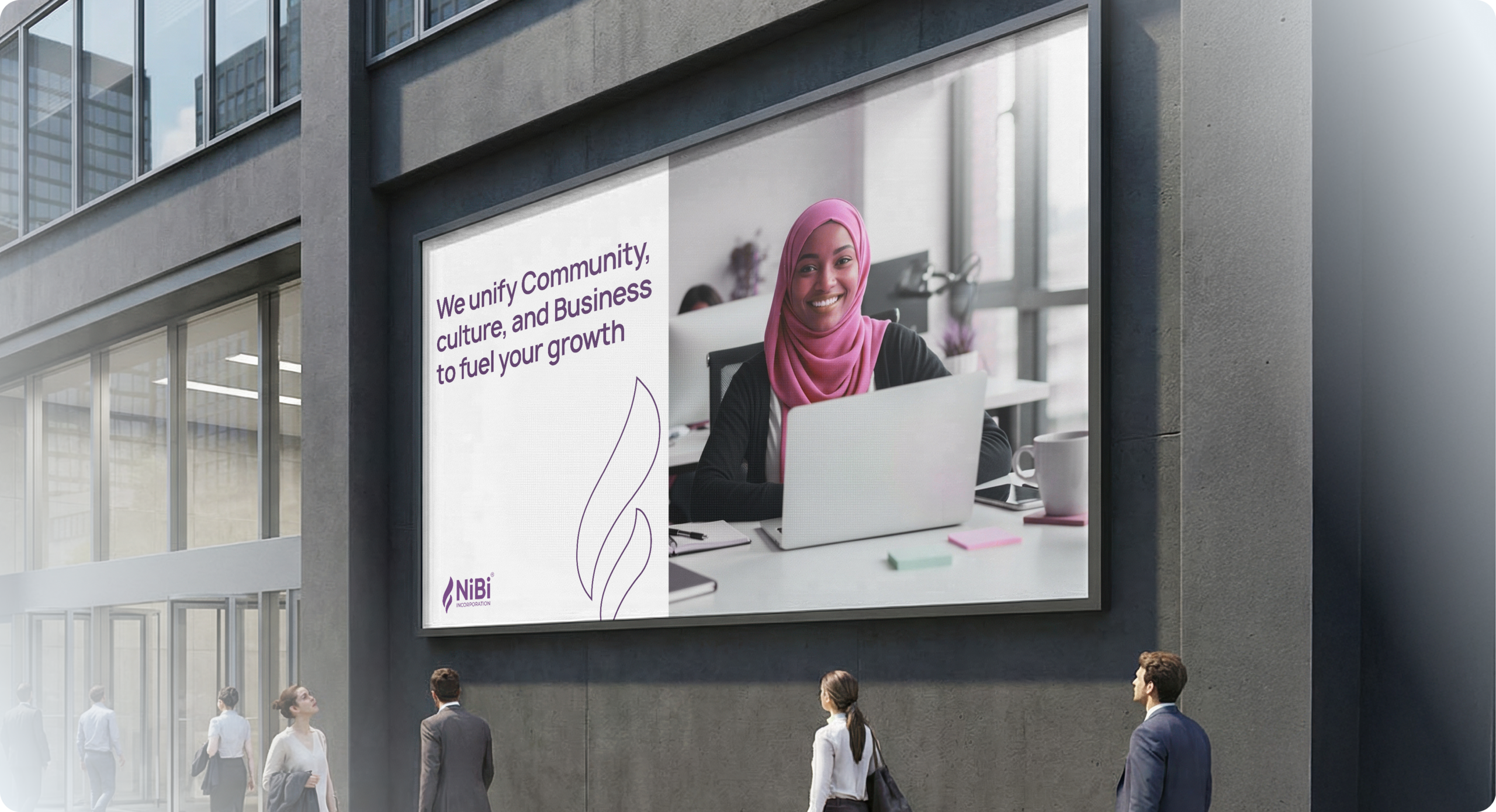
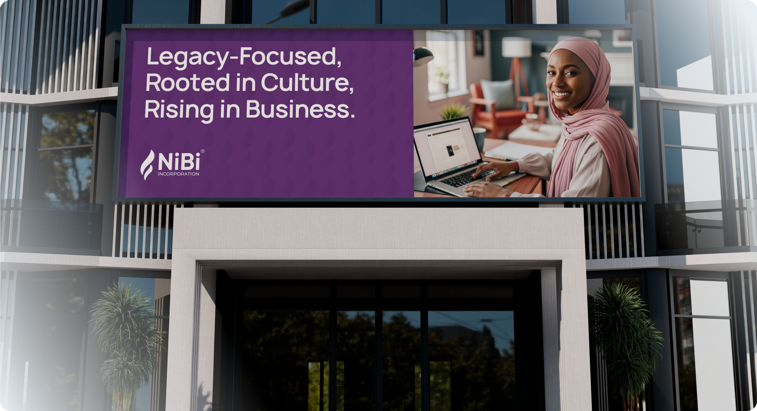
Read case studyNIBI Incorporation the business arm of NIMACO in Central Ohio, USA. A body built on community, achievement, and international business initiatives. The logo is stunning a dual flowing flame in rich purple, paired with the distinctive mixed-case "NiBi" wordmark. The flame isn't just decorative it symbolises celebration, grand achievement, and the spirit of a torch being carried forward.
NIBI Incorporation; NIMACO International Business Initiatives is the commercial arm of NIMACO, the Nigeria Muslim Association of Central Ohio, United States of America. Born from a community with deep cultural roots and global ambitions, NIBI was established to drive international business initiatives that create real economic impact. More than a company, NIBI is a bridge connecting the Nigerian diaspora in the United States to business opportunities, partnerships, and platforms that reflect the strength and potential of their community. A body built not just for profit, but for progress.
NIBI Incorporation represents a proud and accomplished community, yet its visual identity did not reflect that strength. As an international business body operating across cultures and borders, it required a brand capable of commanding respect in boardrooms, resonating deeply with its community, and communicating its purpose instantly. Without a cohesive identity, an organisation of such significance risked being overlooked in the very spaces it was built to lead. What it needed was more than just a symbol of business but a mark that truly honours the people behind it.
We approached the NIBI identity with one guiding question: what does achievement look like when it belongs to an entire community?
Our process began with understanding the essence of NIBI, not merely as a business initiative, but as a bold declaration. A diaspora community stepping confidently onto the global stage, carrying culture, faith, and ambition in equal measure.
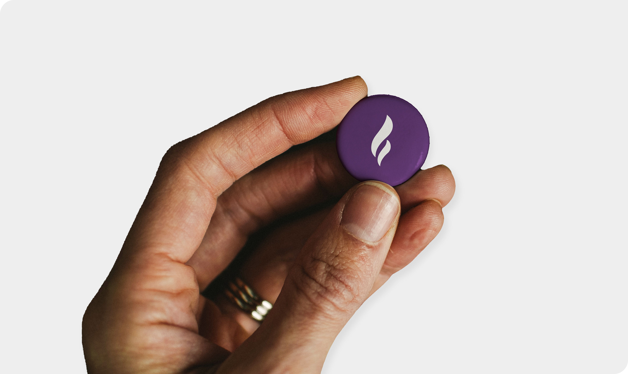
The flame emerged as the most fitting symbol for this narrative. Universally recognised as a mark of celebration and arrival, it embodies the spirit of moments like the Olympic torch and the eternal flame. We crafted two fluid flame forms, intertwined yet distinct, to reflect the dual nature of NIBI as both community and commerce, while also symbolising continuity, progress, and the passing of legacy from one generation to the next.
Purple was selected with precision. Regal, refined, and uncommon, it communicates vision and distinction with quiet confidence. In a landscape saturated with predictable corporate palettes, it positions NIBI as both memorable and elevated.
The mixed-case NiBi wordmark was an intentional typographic decision. The uppercase N and B establish strength and presence, while the lowercase i characters introduce warmth and accessibility, creating a balance between authority and approachability.
Every element was considered, every decision deliberate. The result is an identity that does more than represent an organisation. It reflects the pride, ambition, and collective achievement of the people behind it.
NIBI emerged with an identity calibrated to the true scale of its ambition. For the first time, the organisation possessed a visual language refined enough for international business environments, yet deeply anchored in the community it represents. The brand established a presence that moves seamlessly across boardrooms, community spaces, and global platforms with clarity, authority, and confidence. What was once underrepresented now carries a distinct, commanding expression one that honours its roots while projecting its vision to the world.
A Series A startup needed a website fast without compromising on quality. We delivered a full custom prototype in 10 days, on time and on budget.
Read case study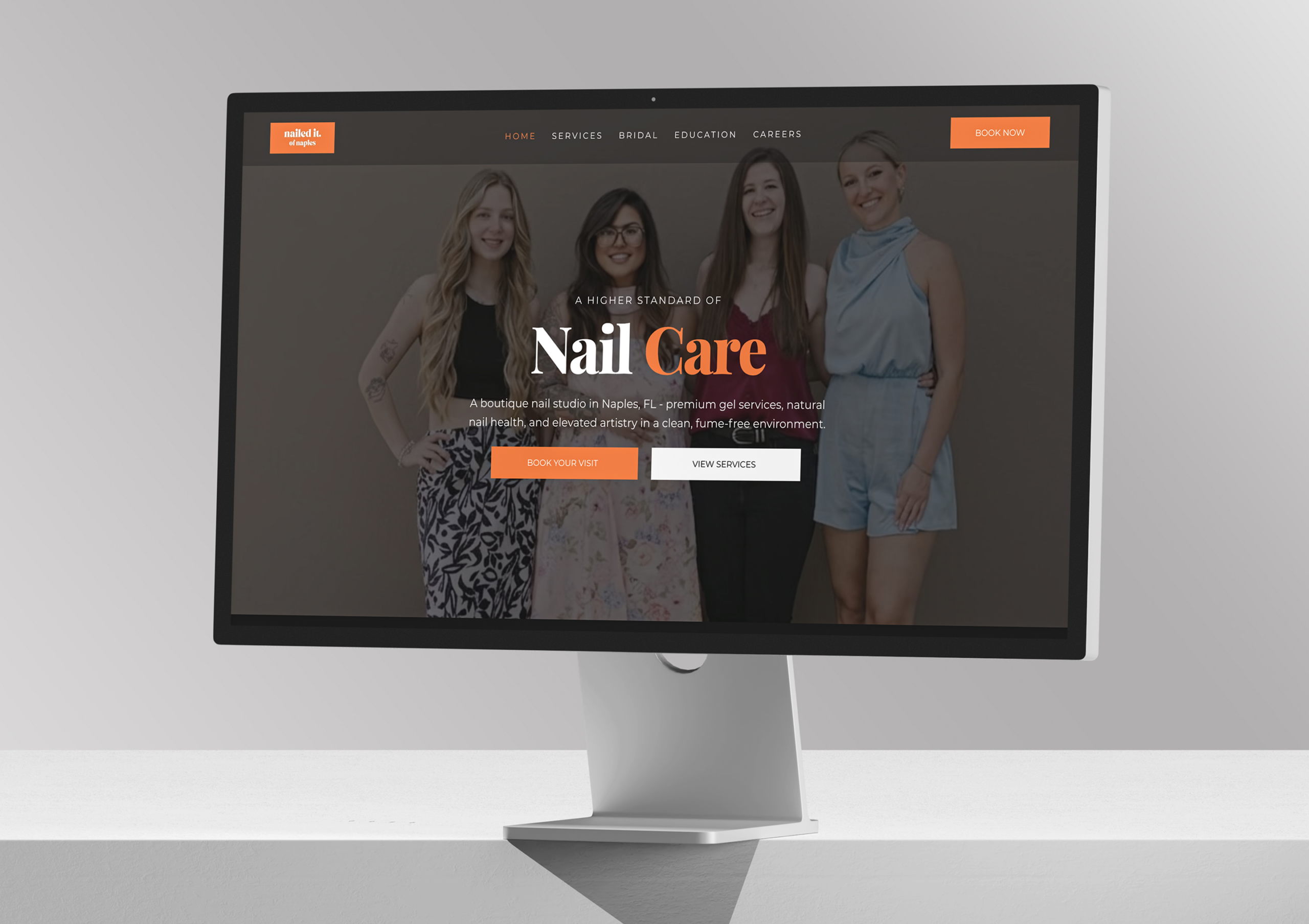
Nailed It of Naples is an award-winning boutique nail studio in Naples led by master technician Samantha Nguyen, and delivers exceptional, recognized craftsmanship but its digital presence lagged behind. Contrivea stepped in to create a refined, editorial, conversion-focused website that now reflects the studio’s true quality.
Read case studyTell us about your project and we'll send you a detailed proposal within 24 hours. No pressure, just a clear path forward.

 ✦ ✦
✦ ✦