SaaS Startup
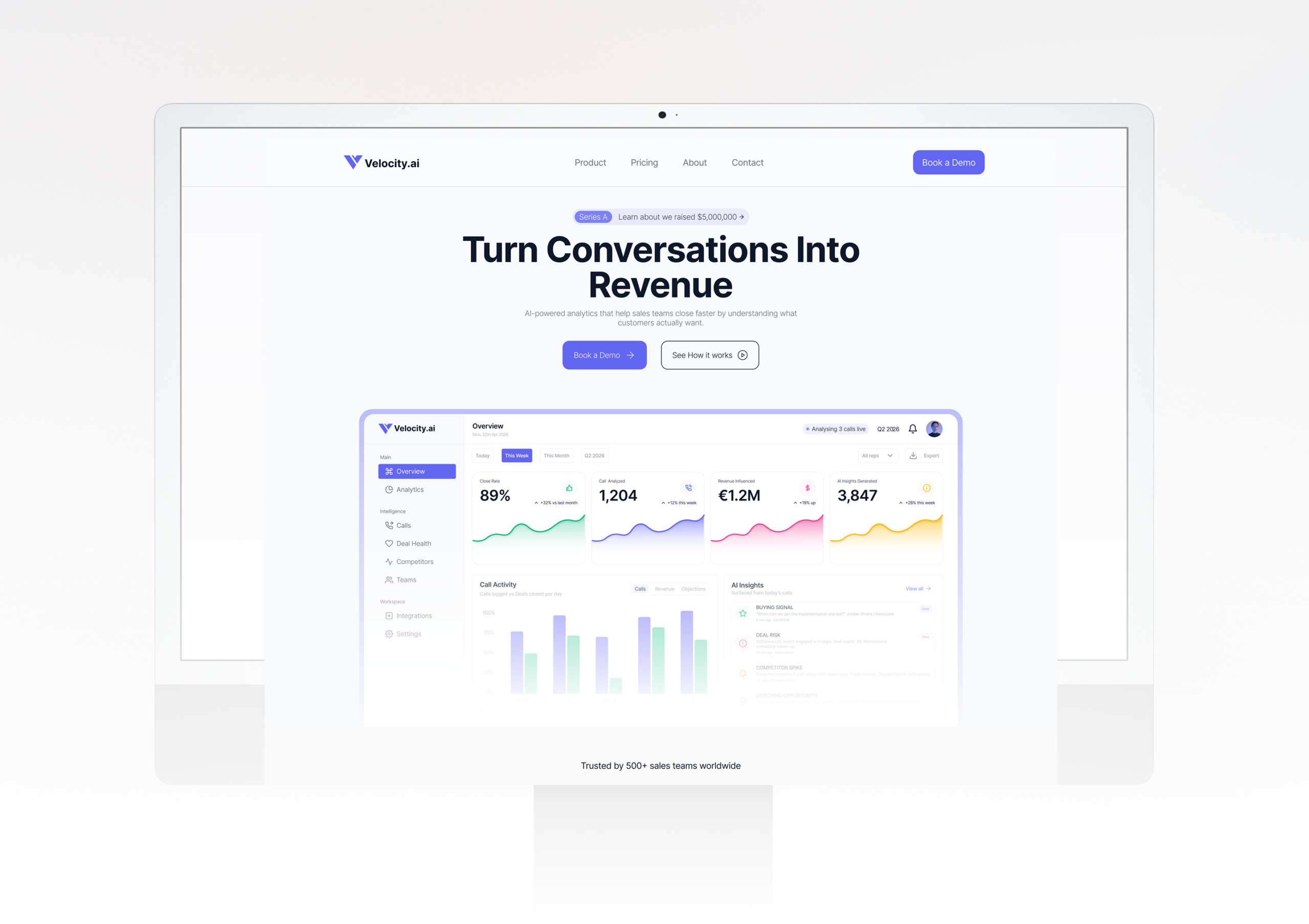
Velocity.ai - From Zero to Launch
A Series A startup needed a website fast without compromising on quality. We delivered a full custom prototype in 10 days, on time and on budget.
Read case studyThis wasn’t a request for a logo it was a mandate to unify ambition at scale. A fully integrated group operating across agriculture, technology, and energy. Four industries, one name, one vision. Our task was to distill that breadth into a single, commanding visual idea a mark strong enough to carry complexity without losing clarity. Not something that merely suggested diversity, but something that embodied it with confidence.
Alfason Group Services is a fully integrated multi-sector group delivering solutions across four key verticals in agriculture, IT, energy, and petroleum. Built on a vision of enhanced global community, the group partners with farmers, industry leaders, and businesses to drive sustainable impact across every sector they operate in. Not a single company with a single focus, but a unified force with the reach and capability to shape industries.
Alfason Group Services had the operations, the ambition, and the reach but lacked a visual identity strong enough to reflect the scale of what they were building. Operating across four distinct industries, they risked looking fragmented rather than unified. Without a cohesive brand, a group this diverse could easily be mistaken for several unrelated businesses rather than one powerful, integrated force. They needed an identity that could hold it all together commanding authority across every sector, every audience, and every market they entered.
We approached the Alfason identity with one core challenge: how do you design a single mark that speaks for four completely different industries without losing its strength in any of them?
We began by studying what Alfason's businesses had in common not what divided them, but what unified them. The answer was clear: precision, reach, and forward momentum. A group that doesn't just enter markets it cuts through them.
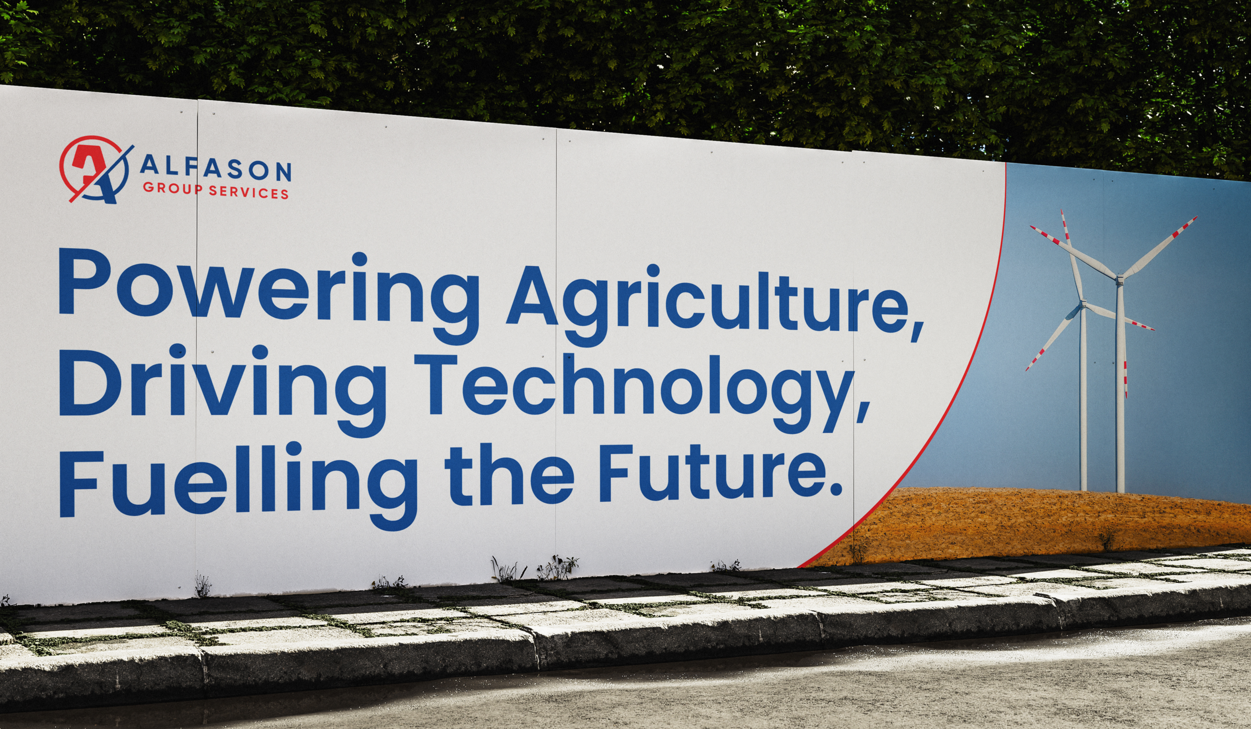
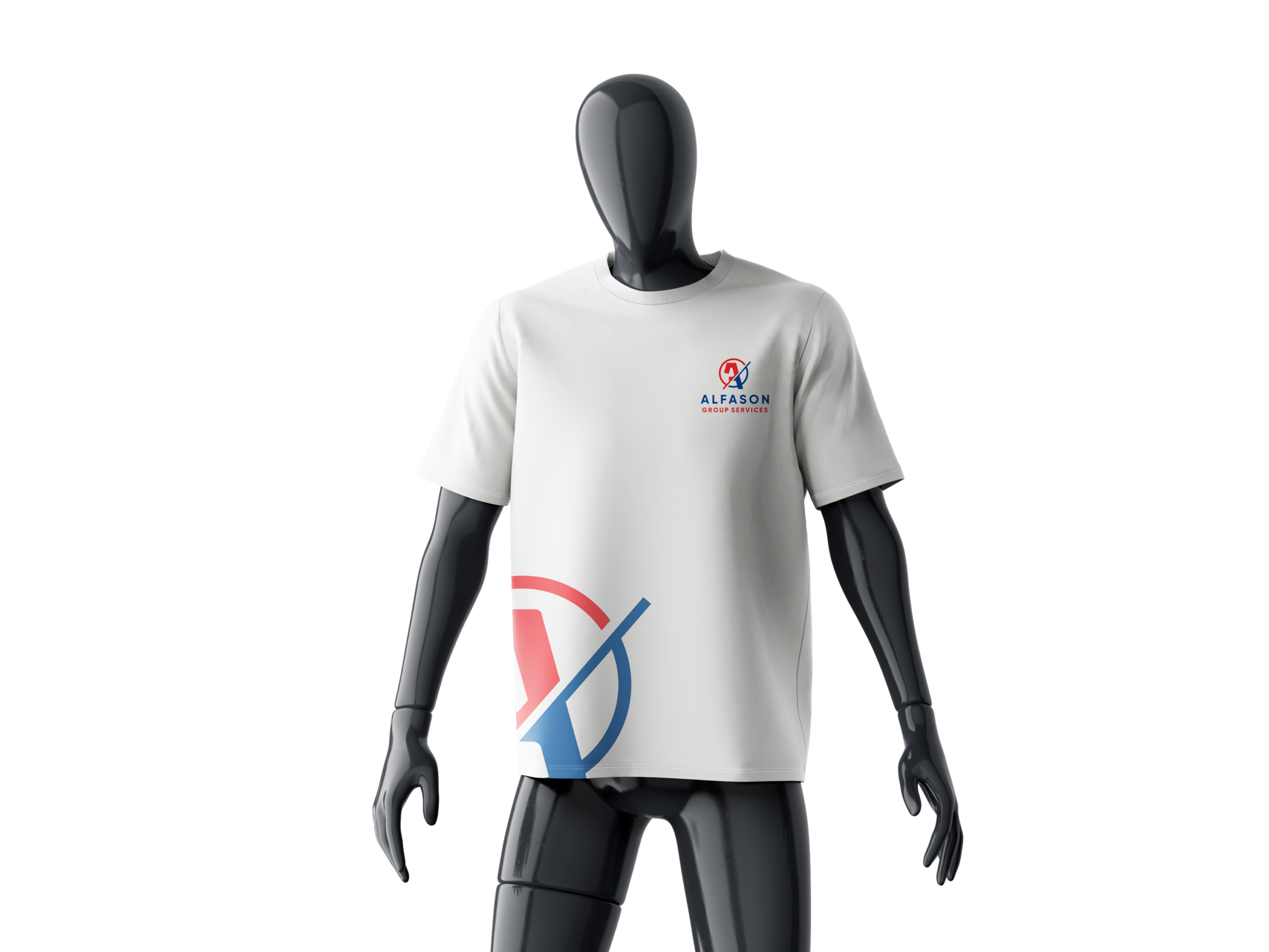
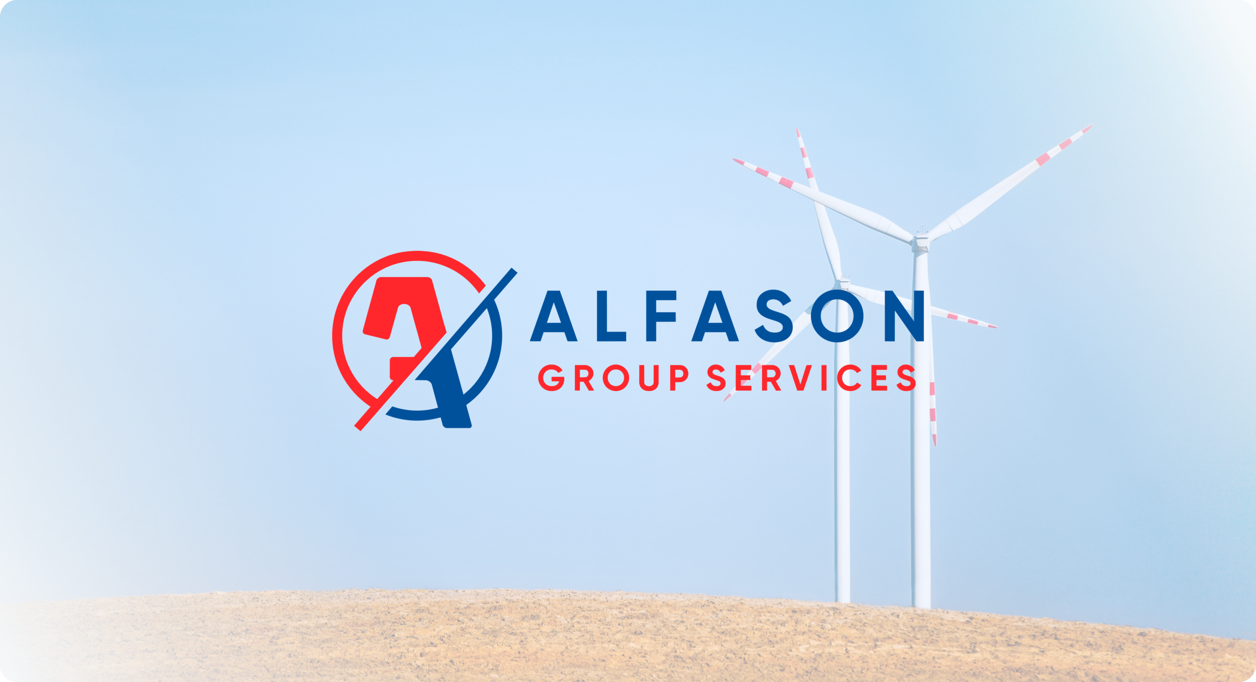
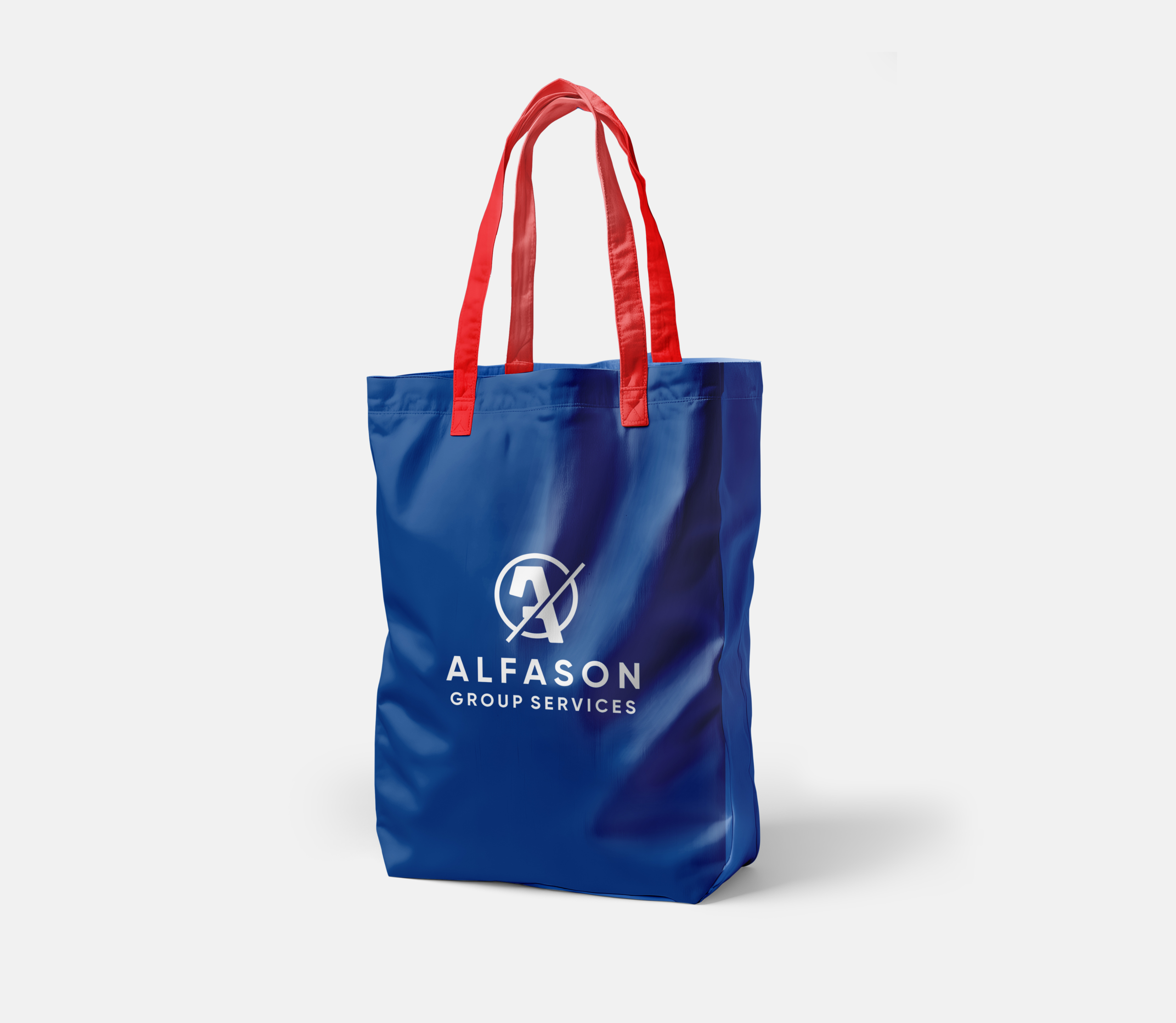
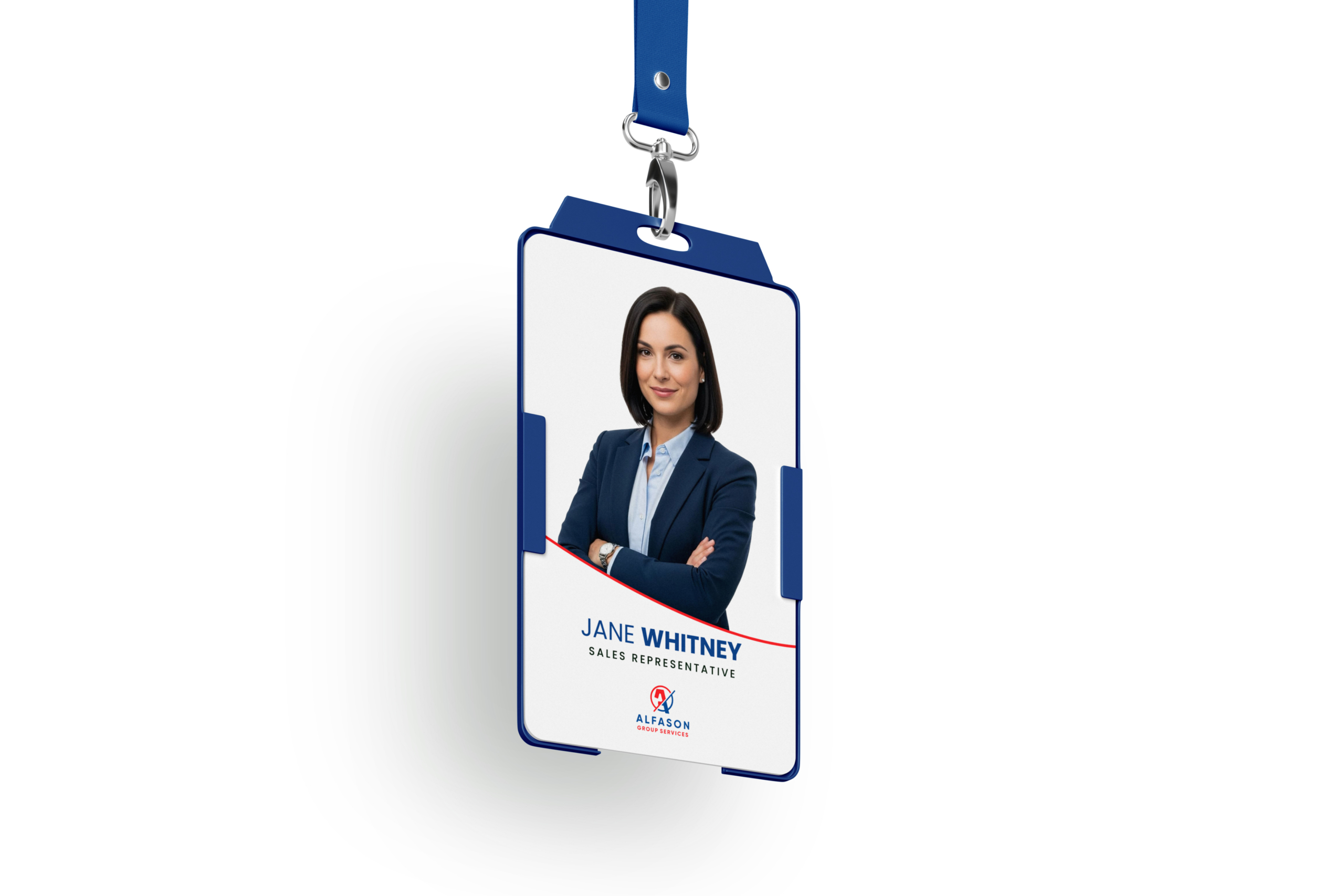
That insight drove the mark. The bold "A" the first letter, the alpha sits at the centre, encircled and cut through by a sharp diagonal slash. The slash isn't decorative. It represents motion, direction, and decisive action. A group always moving forward. The circle speaks to unity all four businesses held within one vision, one name, one identity.
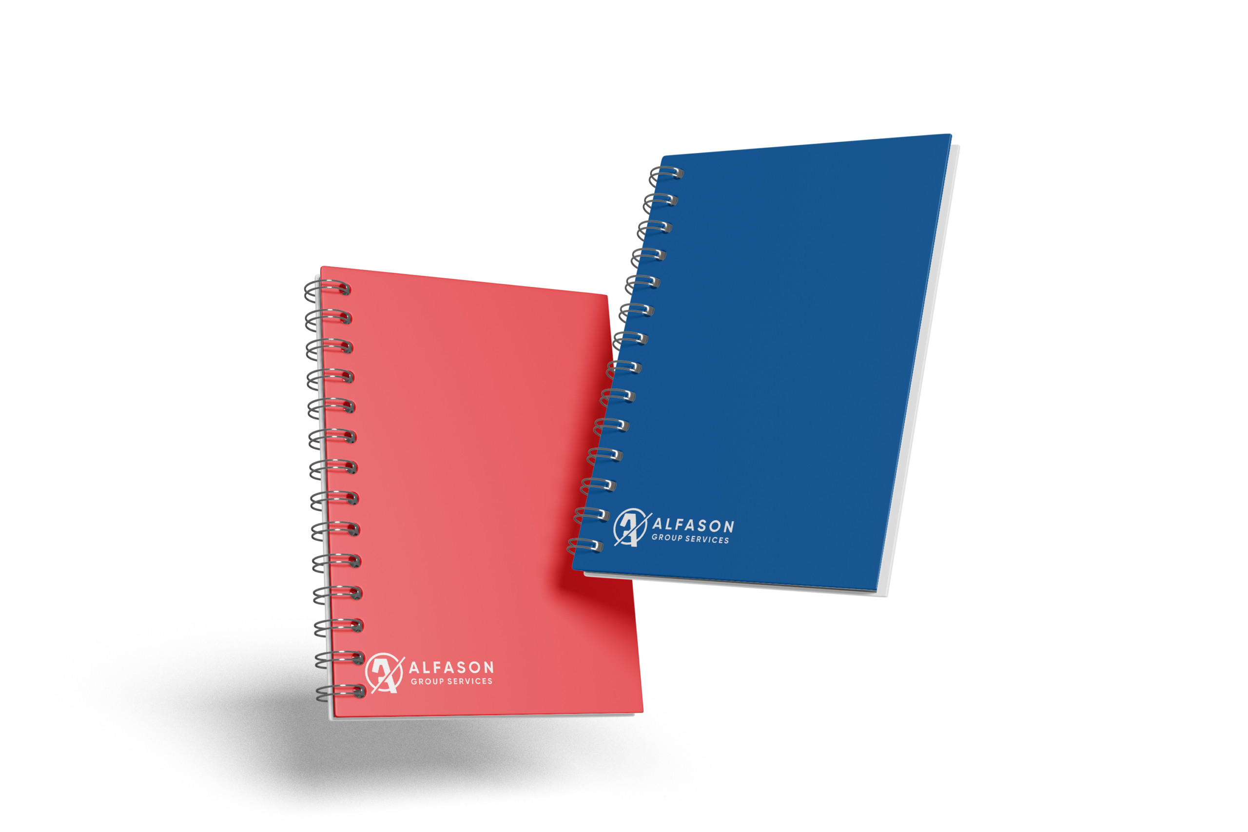
The dual colour split between red and navy was deliberate. Red for energy, boldness, and ambition. Navy for trust, depth, and stability. Together they don't clash they balance. Two forces, one group.
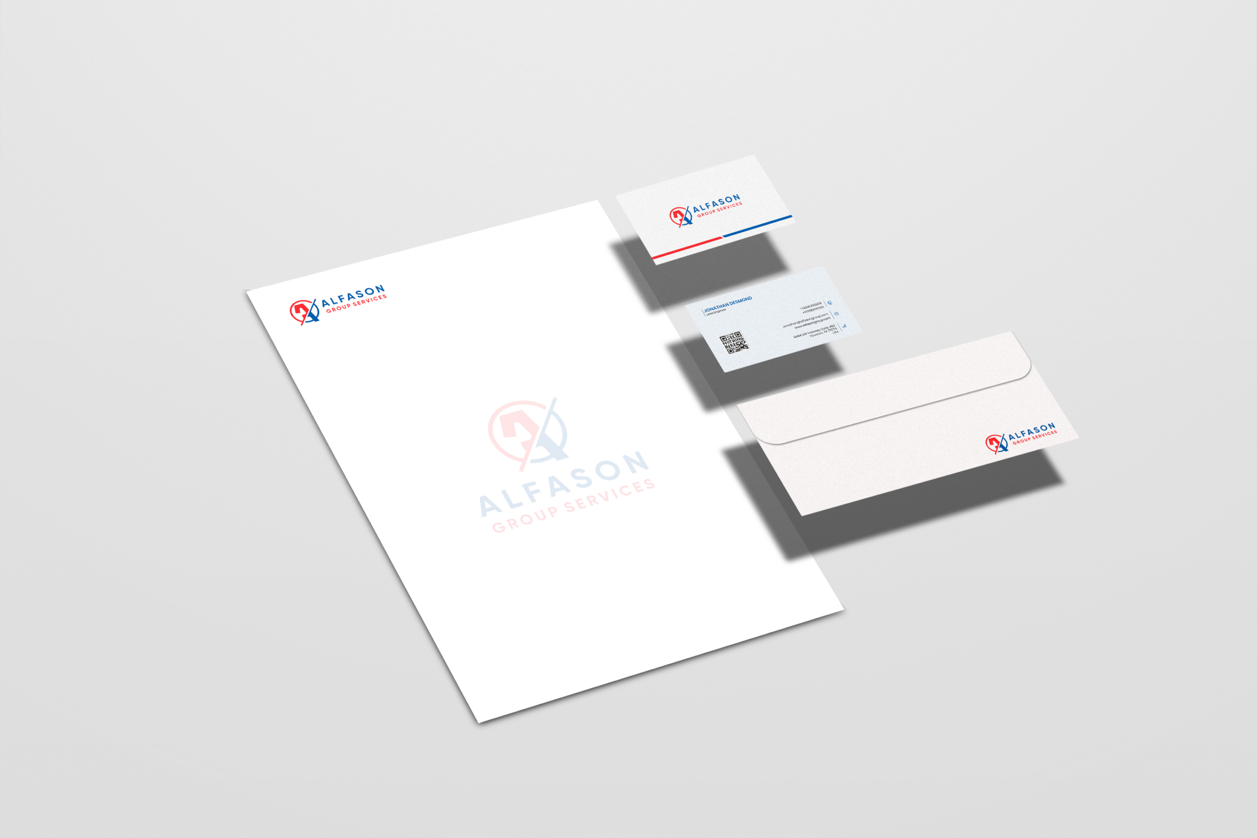
The wordmark was set wide and heavy authoritative enough to anchor the icon and confident enough to stand alone.
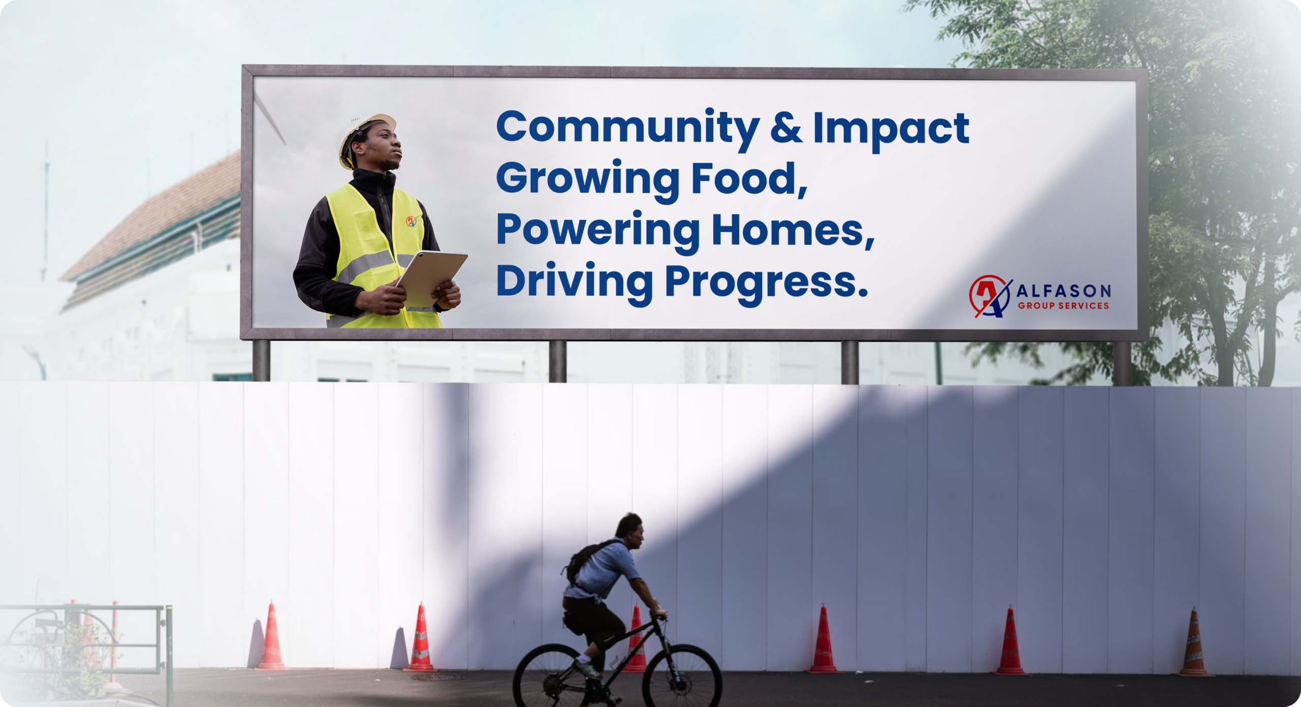
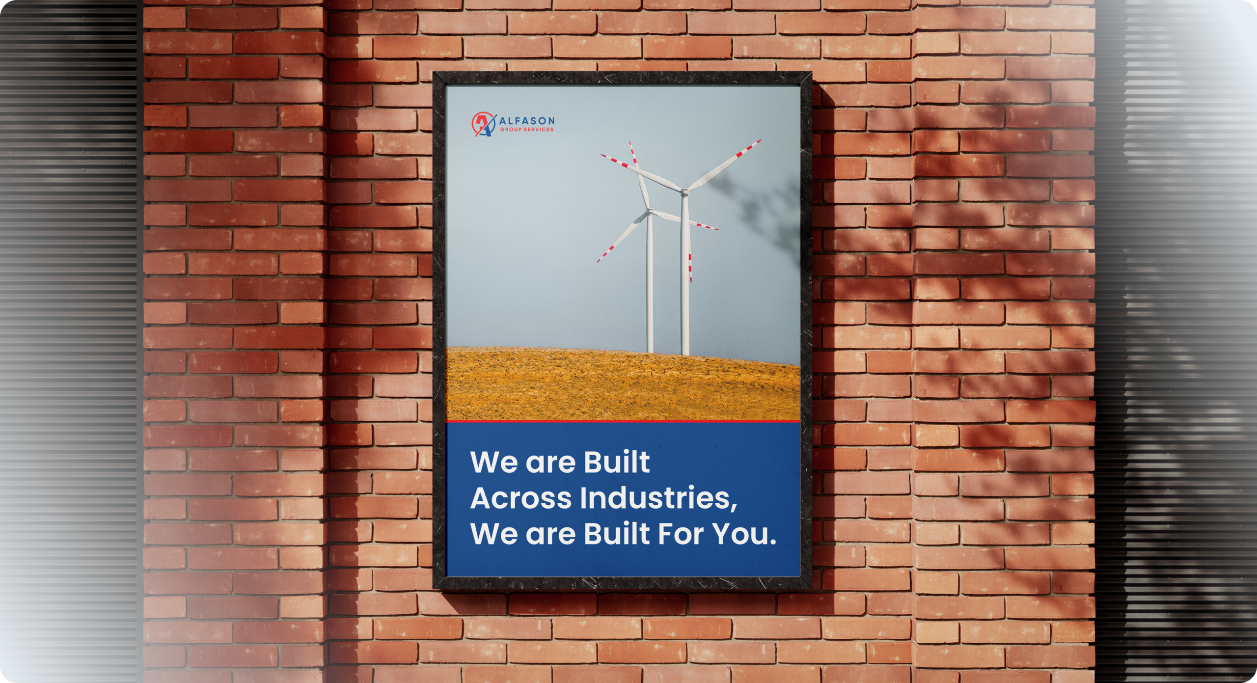
By the end of the process, Alfason had an identity aligned with the full weight of its ambition. For the first time, its four business verticals operated under a single, cohesive visual system structured, commanding, and instantly recognisable. The brand established the authority required to engage corporate clients, government institutions, and international partners with confidence. What once risked appearing fragmented now presents as it truly is a unified force, built to lead across industries.
A Series A startup needed a website fast without compromising on quality. We delivered a full custom prototype in 10 days, on time and on budget.
Read case study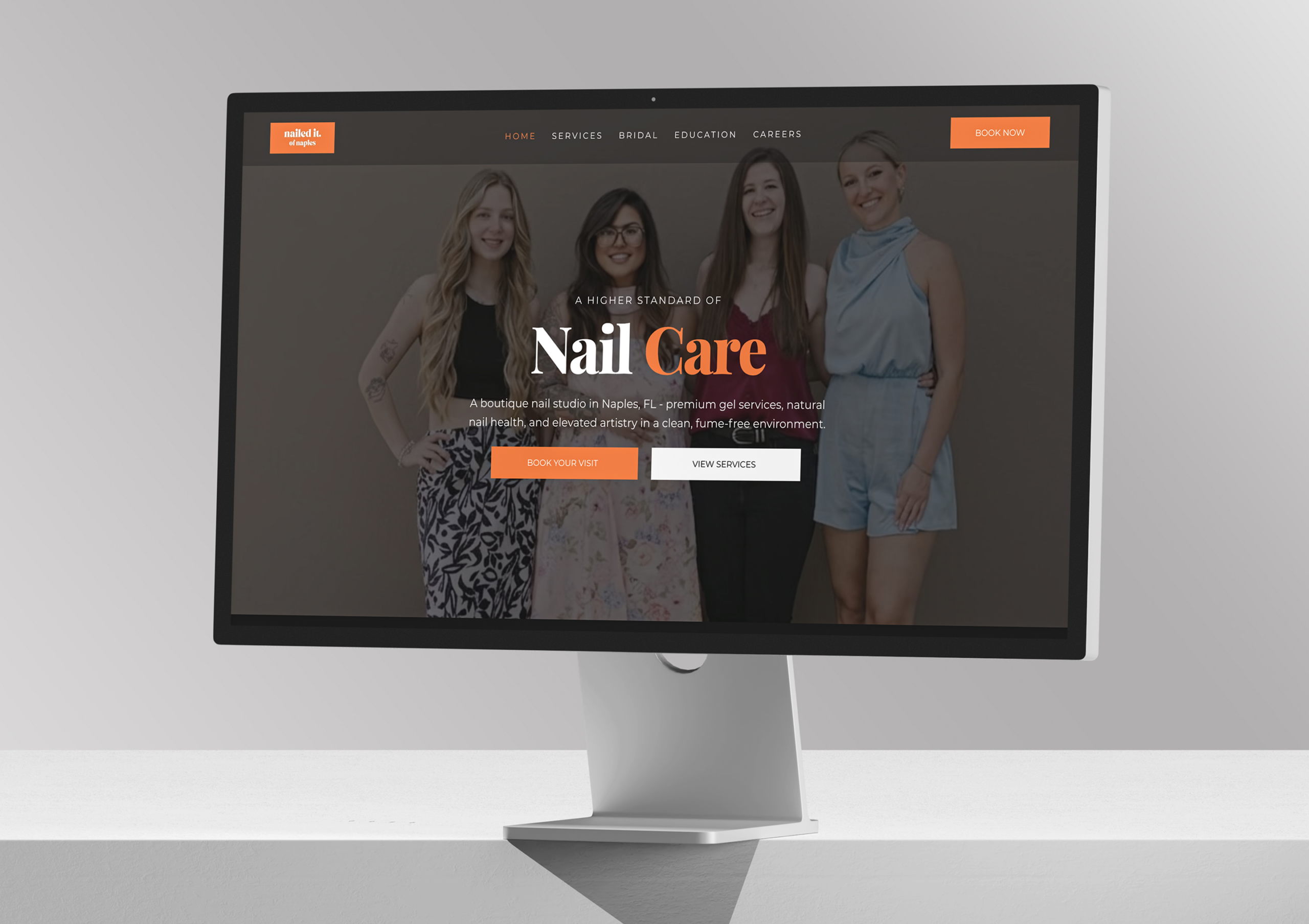
Nailed It of Naples is an award-winning boutique nail studio in Naples led by master technician Samantha Nguyen, and delivers exceptional, recognized craftsmanship but its digital presence lagged behind. Contrivea stepped in to create a refined, editorial, conversion-focused website that now reflects the studio’s true quality.
Read case studyTell us about your project and we'll send you a detailed proposal within 24 hours. No pressure, just a clear path forward.

 ✦ ✦
✦ ✦