SaaS Startup
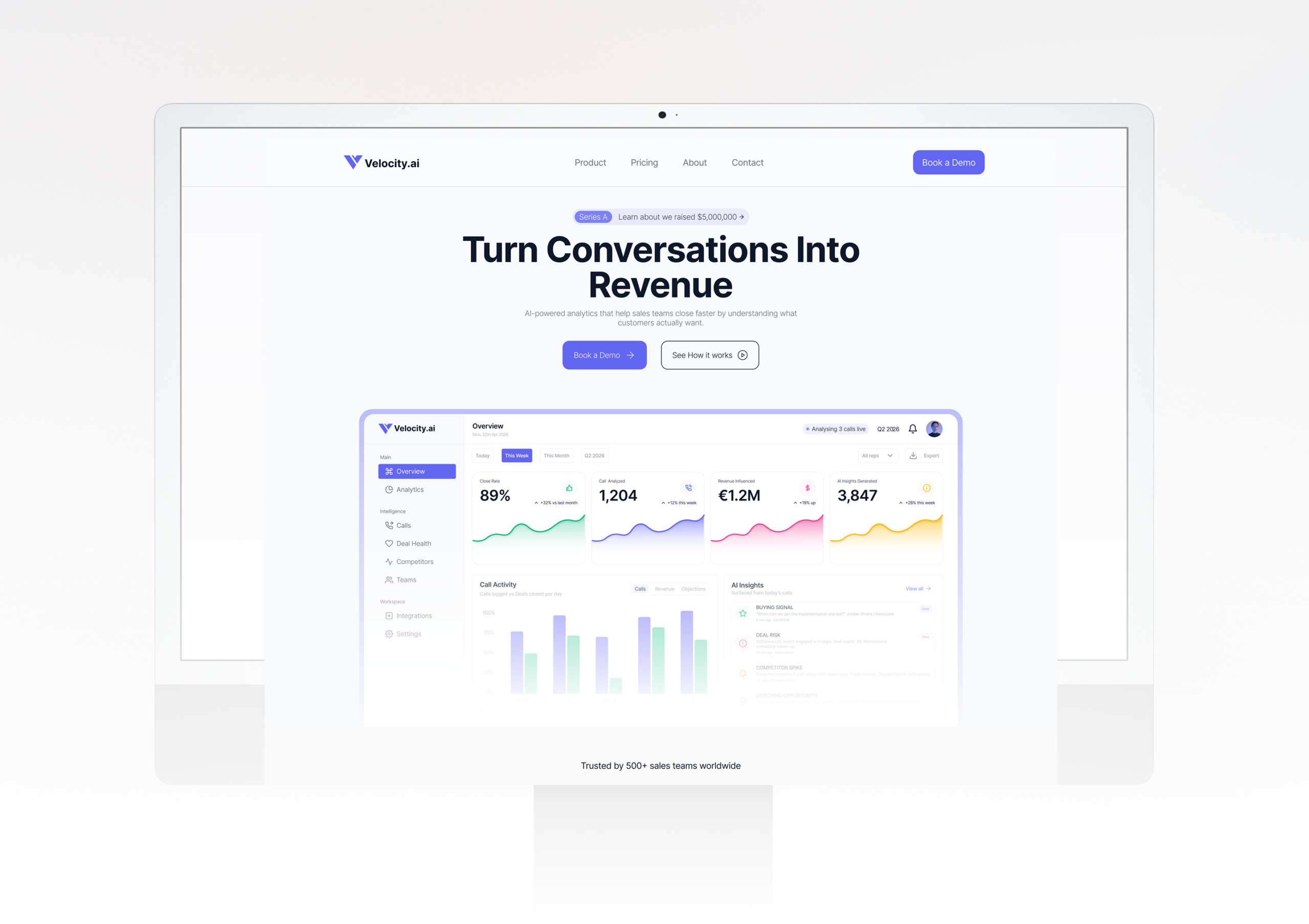
Velocity.ai - From Zero to Launch
A Series A startup needed a website fast without compromising on quality. We delivered a full custom prototype in 10 days, on time and on budget.
Read case studyIgnition One didn't come to us for a logo. They came with a mission to power communities, fight energy poverty, and lead Australia's clean energy future. Our job was to compress all of that purpose into a single, unforgettable mark.
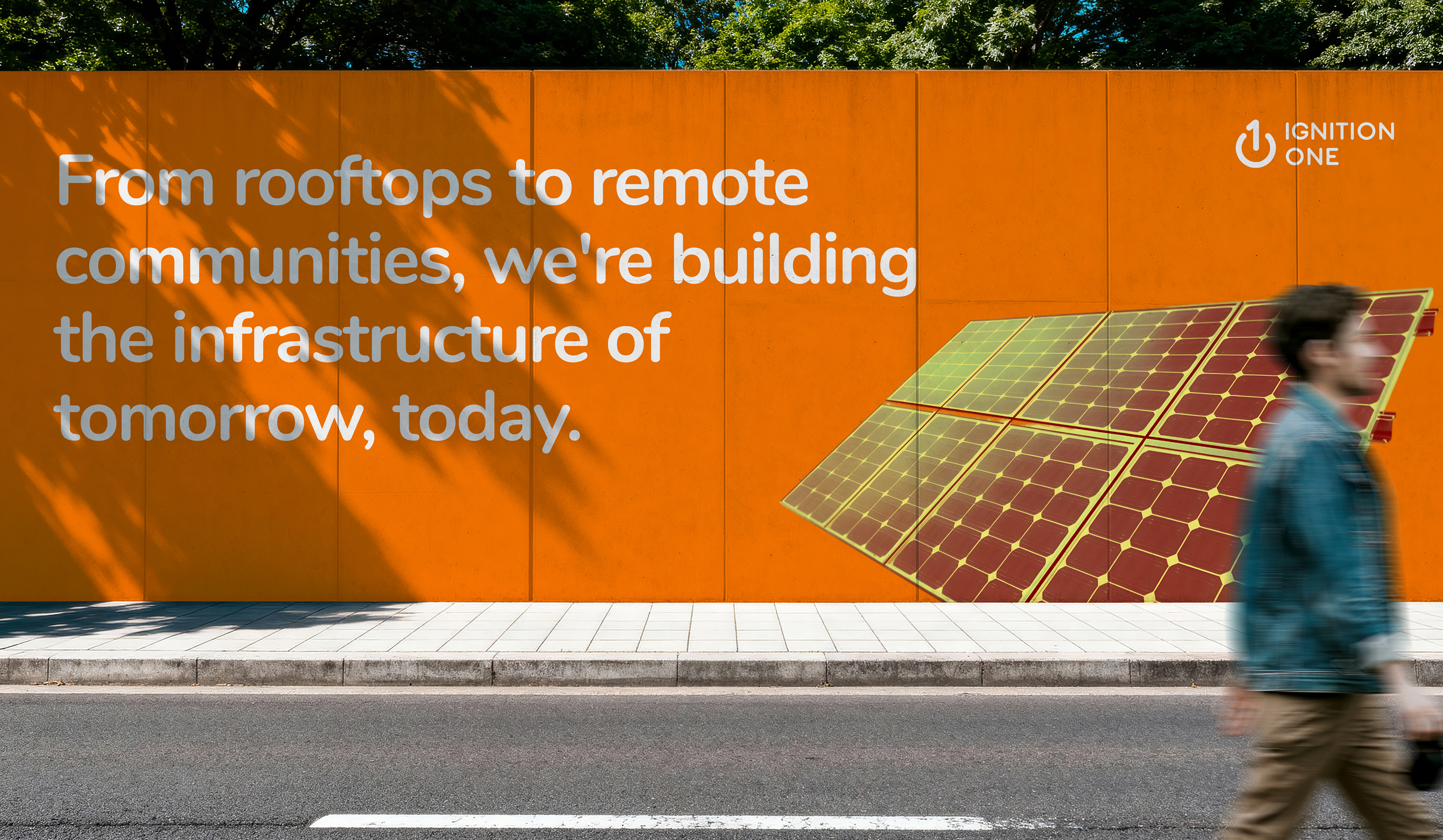
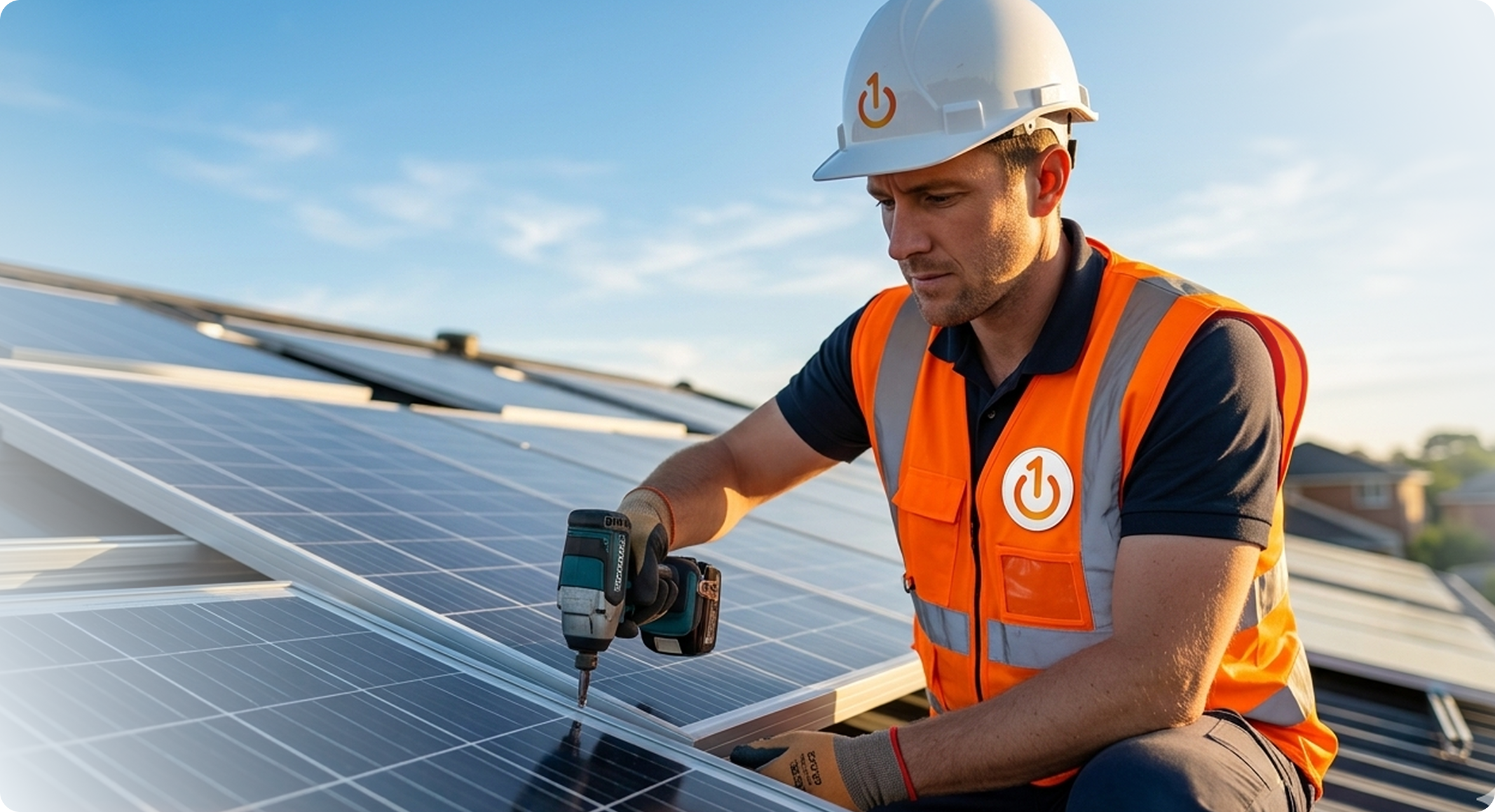
Ignition One is an Australian clean energy specialist delivering solar and battery solutions to homes, businesses, and NGOs. Headquartered in Queensland, they manage projects from design to construction all while driven by a deeper purpose: fighting energy poverty on a global scale.
Ignition One had a powerful mission but lacked a visual identity strong enough to match it. Operating in a competitive clean energy market, they needed more than just a logo, they needed a brand that could command authority, communicate purpose, and build instant trust with homeowners, businesses, and NGOs alike. Without a distinctive identity, a company with this much vision risked going unnoticed in a space where standing out is everything.
Contrivea approached the Ignition One identity with a single guiding principle: the brand had to earn attention before it asked for trust.
We began with immersion studying the clean energy landscape, understanding the audience, and identifying what truly set Ignition One apart. This was not just another solar company; it was a movement grounded in purpose and social responsibility.
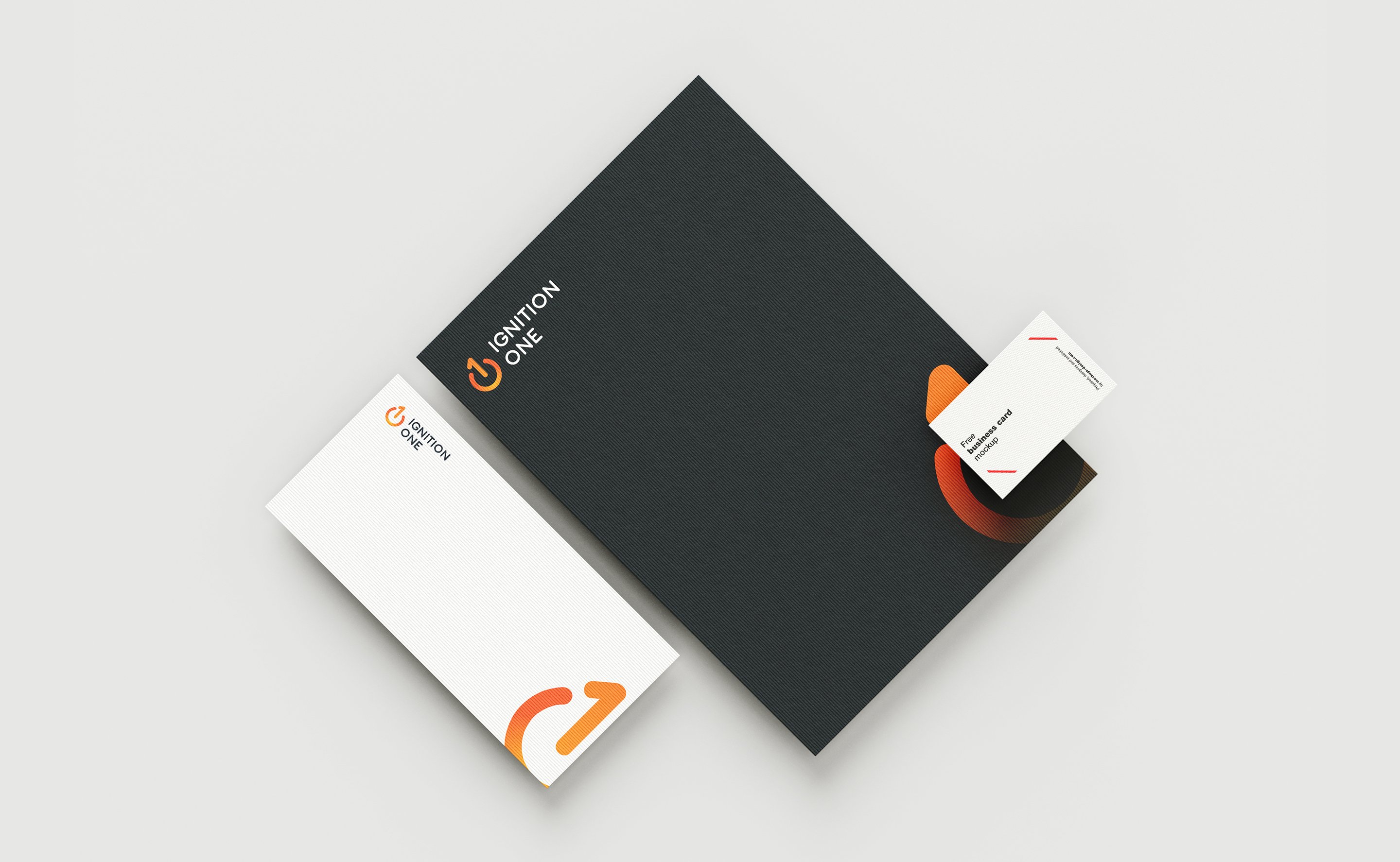
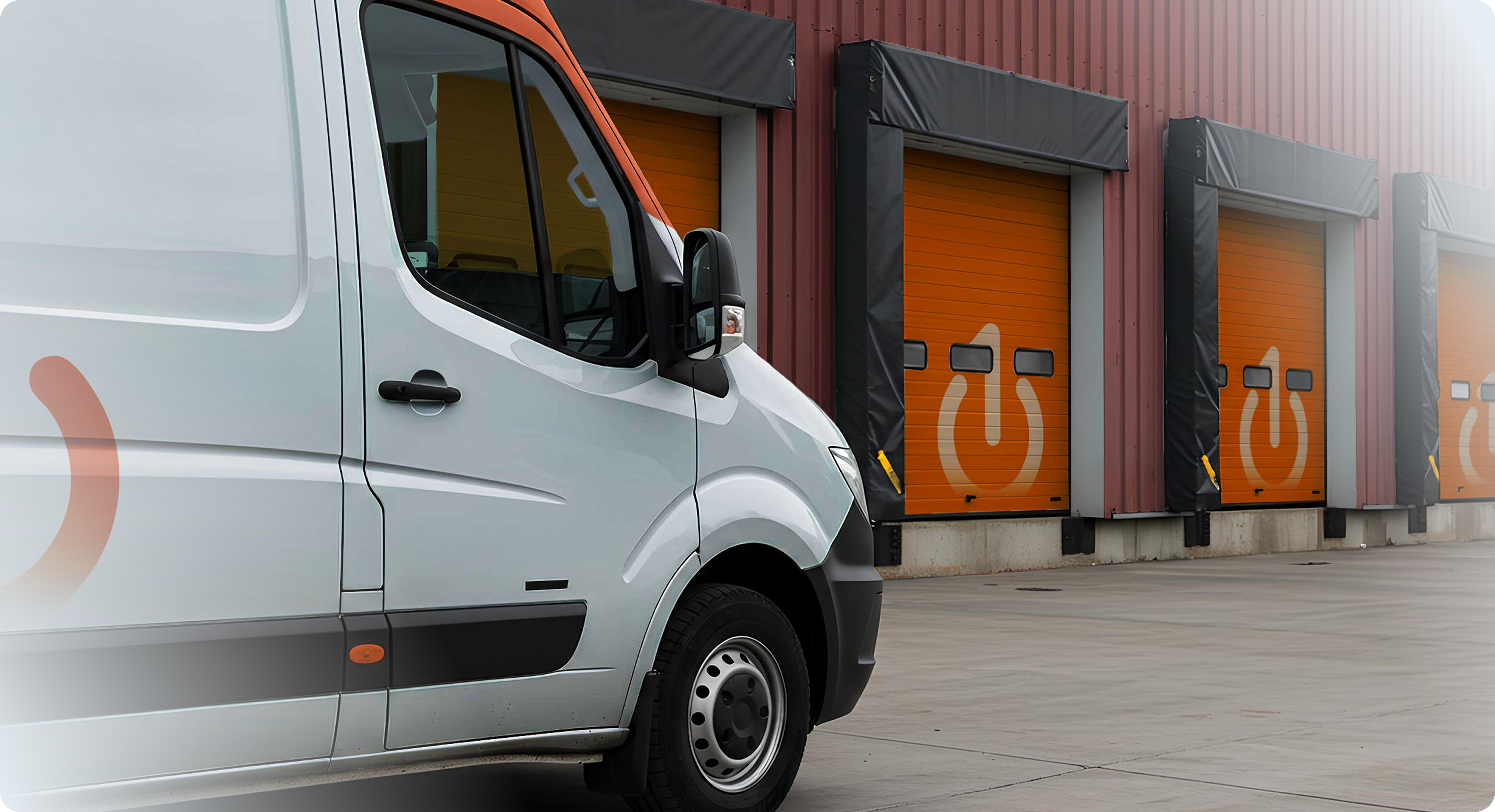
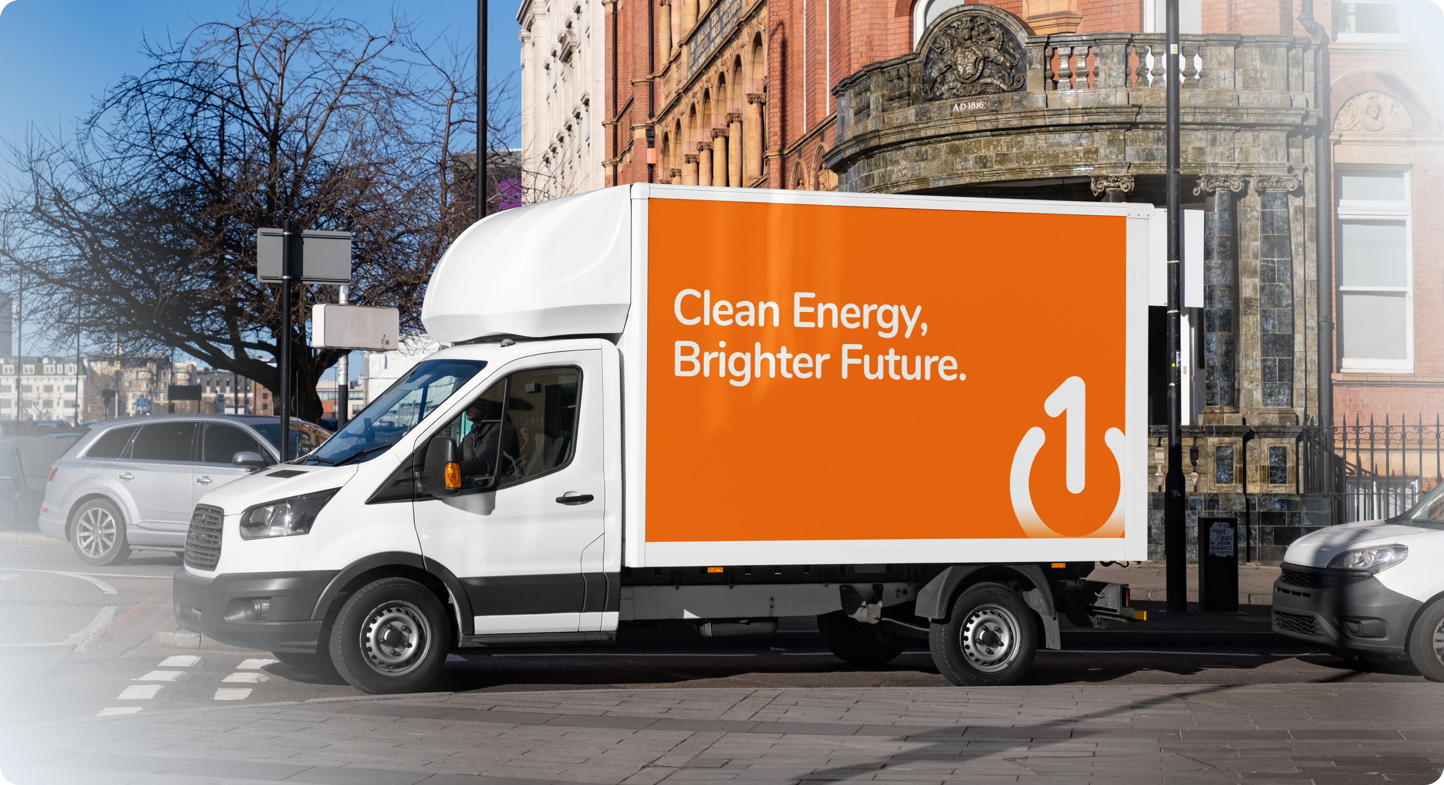
From there, we moved into concept exploration. The challenge was to find a symbol capable of carrying two ideas at once: energy and identity. The power button quickly emerged as the perfect vehicle universal, instantly recognizable, and inherently tied to activation and change. By embedding the numeral "1" into its stem, the mark gained a second layer of meaning: primacy, leadership, the first switch you flip.
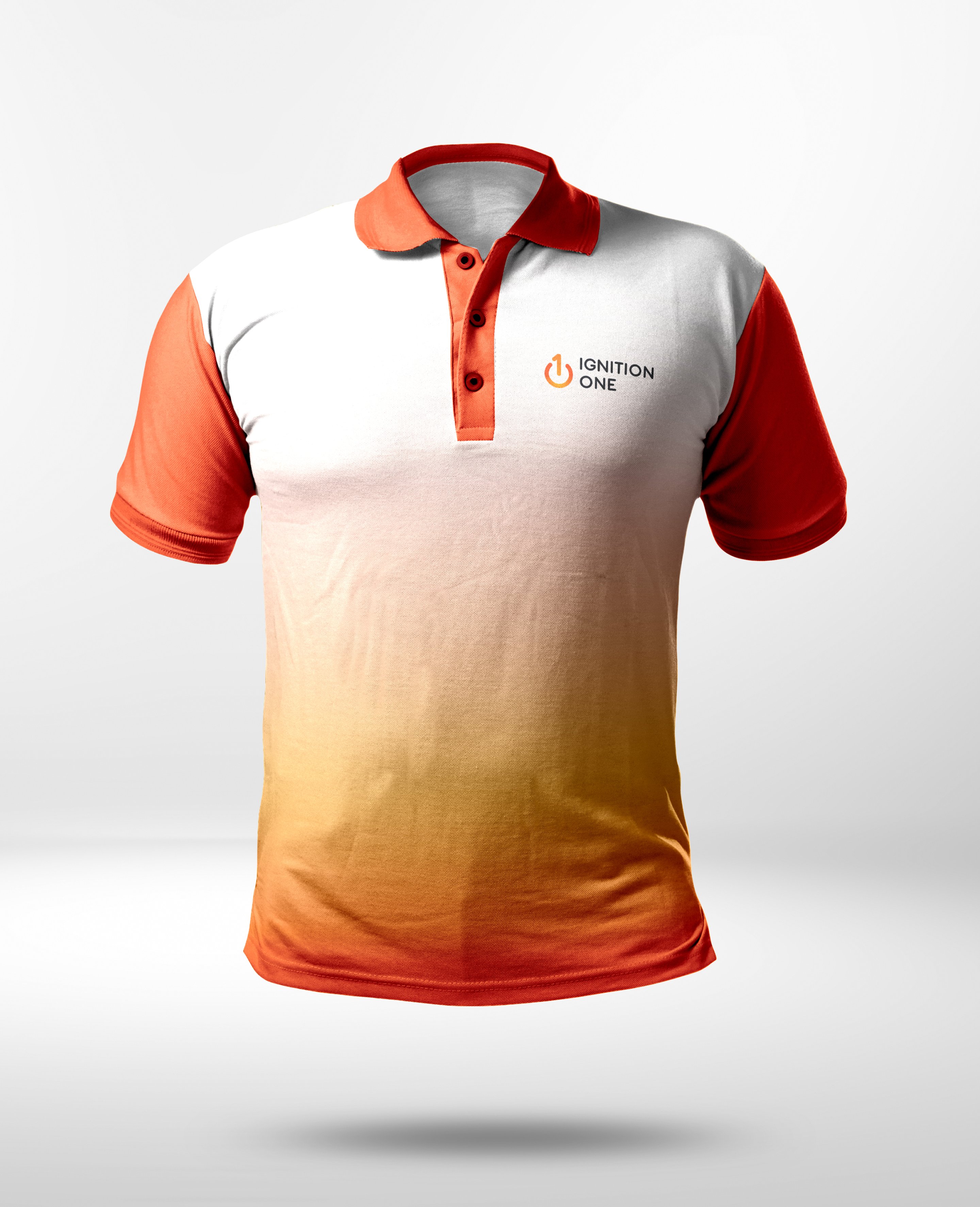
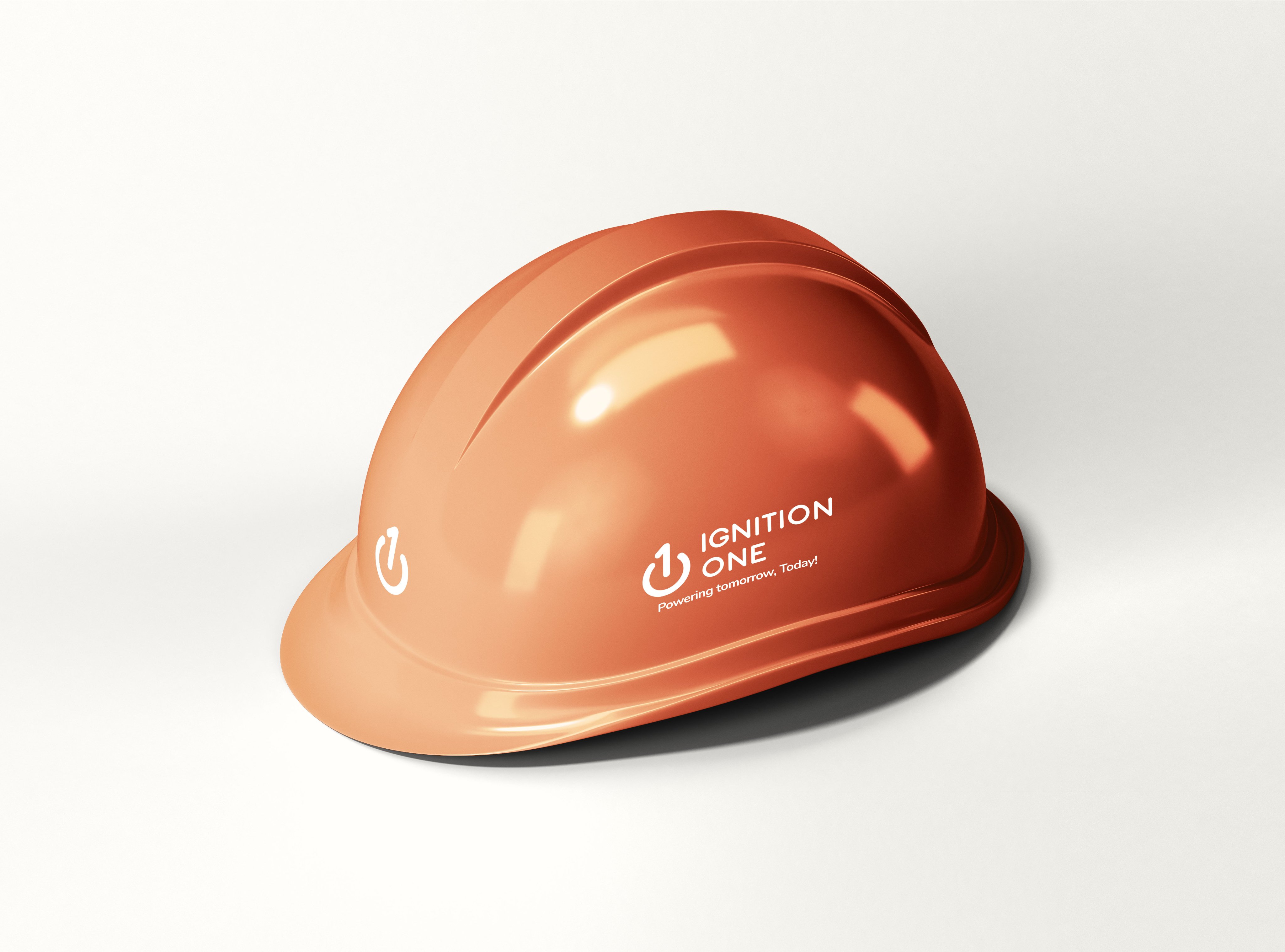
Colour played a strategic role. The gradient transitioning from deep ember red to warm solar orange was chosen to reflect the essence of energy itself: heat, light, and motion. It communicates the story instinctively, without needing explanation.
The wordmark was set in a heavy geometric typeface with tight tracking bold enough to stand confidently alongside the icon, yet restrained enough to project credibility and trust. Every decision served the same brief: to create something distinctive in a crowded market while remaining purposeful and grounded.
The result is an identity system that does more than look the part it carries meaning.
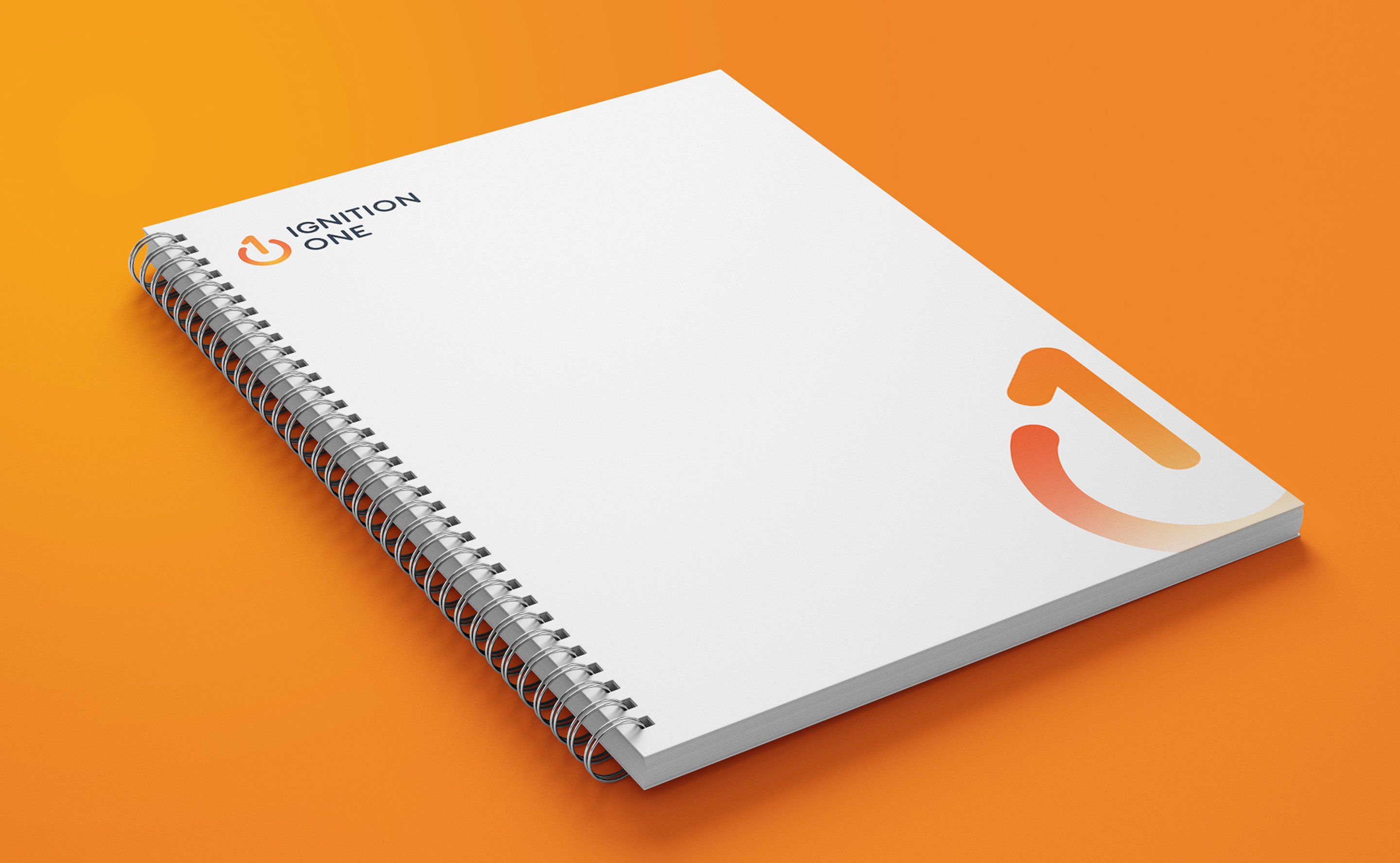
Ignition One gained more than a logo they gained a visual identity capable of matching the scale of their mission. The new brand equips them with the authority to stand confidently in a crowded market, the clarity to communicate their purpose at a glance, and the credibility needed to earn the trust of homeowners, businesses, and NGOs alike. For the first time, their identity truly reflects the ambition and impact of what they are building.
Contrivea transformed our brand from generic to unforgettable. Within 6 weeks of launching our new website, we saw a 240% increase in qualified leads. They understood our vision better than we did.
A Series A startup needed a website fast without compromising on quality. We delivered a full custom prototype in 10 days, on time and on budget.
Read case study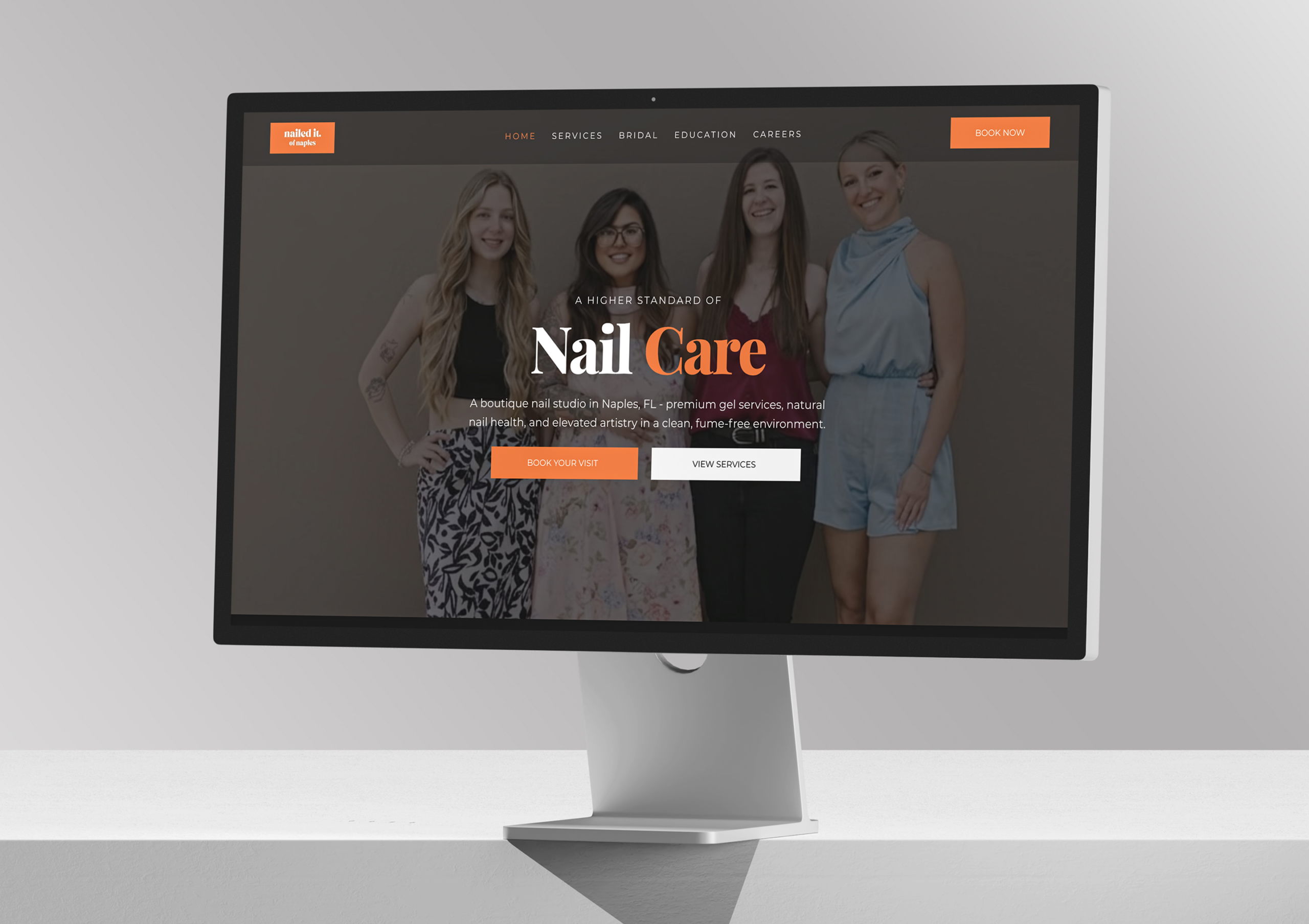
Nailed It of Naples is an award-winning boutique nail studio in Naples led by master technician Samantha Nguyen, and delivers exceptional, recognized craftsmanship but its digital presence lagged behind. Contrivea stepped in to create a refined, editorial, conversion-focused website that now reflects the studio’s true quality.
Read case studyTell us about your project and we'll send you a detailed proposal within 24 hours. No pressure, just a clear path forward.

 ✦ ✦
✦ ✦