SaaS Startup
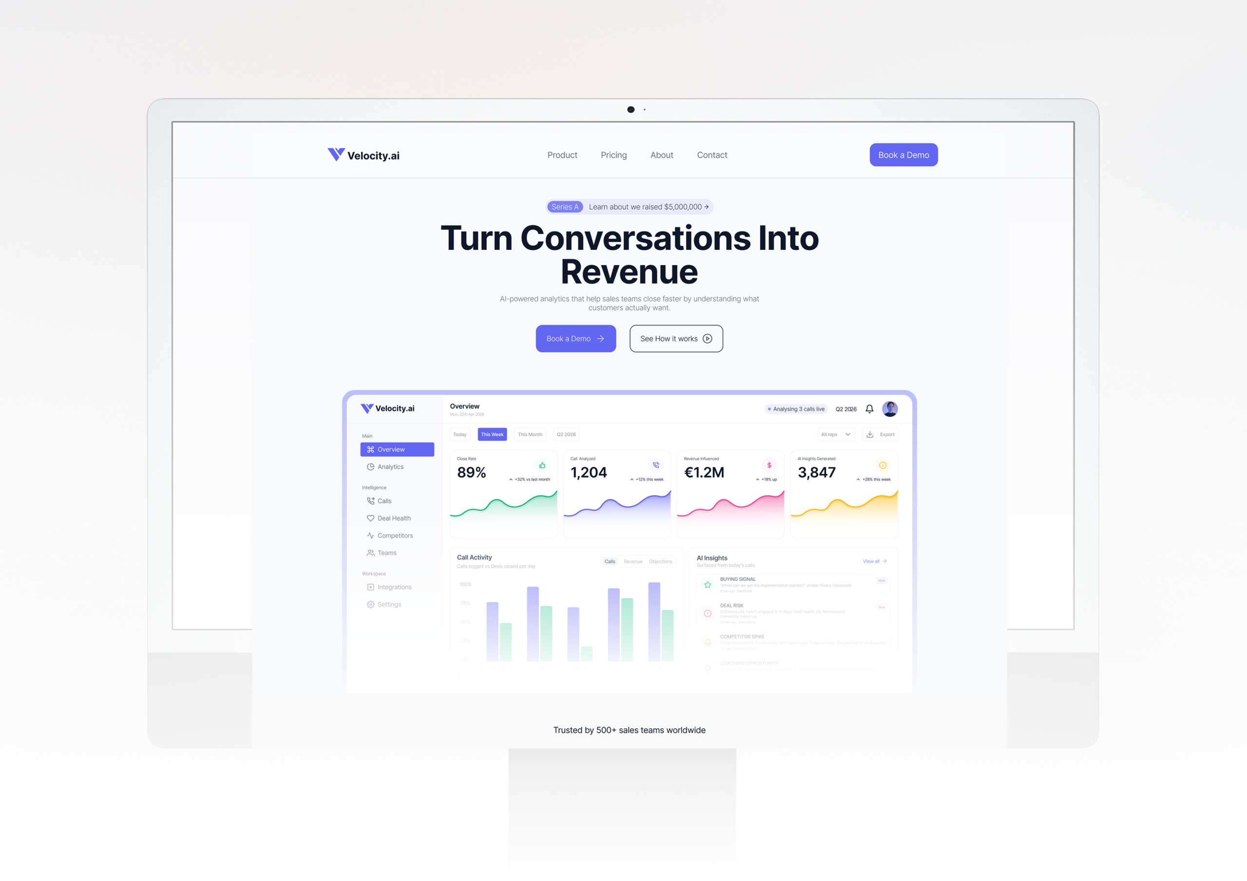
Velocity.ai - From Zero to Launch
A Series A startup needed a website fast without compromising on quality. We delivered a full custom prototype in 10 days, on time and on budget.
Read case studyModern teams don't have a productivity problem. They have a clarity problem. Targe was built to solve exactly that. A modern workspace designed to help makers, founders, and product teams manage tasks, track progress, and ship work without the clutter, complexity, and cognitive load of traditional project tools. Our task was to design a product that felt as sharp and focused as the people it was built for. Simplify how you work. Amplify what you deliver.
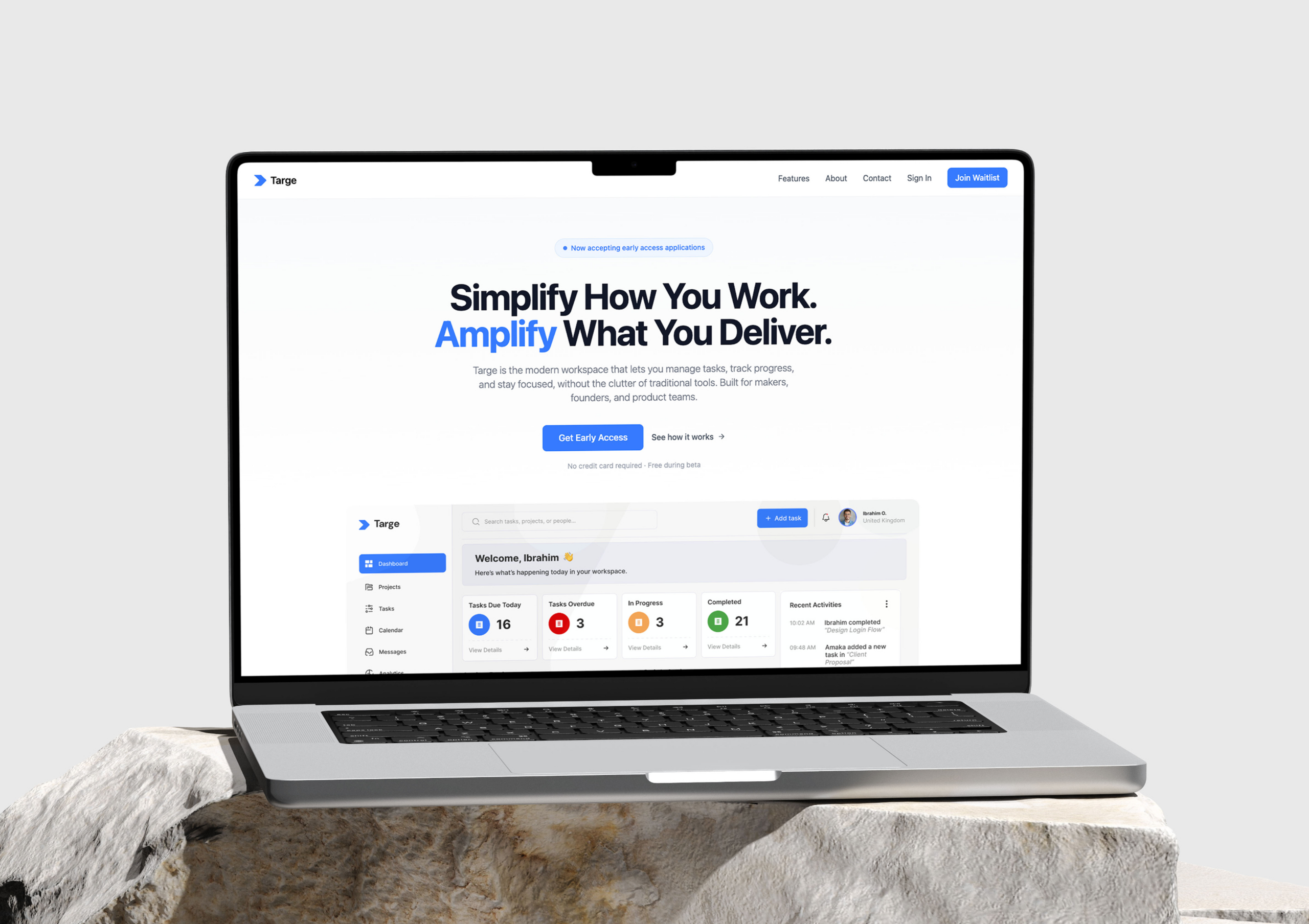
Teams building products were drowning in tools that were supposed to help them. Bloated project management platforms packed with features nobody used, cluttered interfaces that created more friction than they removed, and disconnected workflows that forced teams to context-switch constantly just to get a clear picture of where things stood. The result was teams spending more time managing their work than doing it. Targe was conceived as the antidote a focused, intelligent workspace that gets out of your way and lets you ship.
Build a workspace that does less but does it better. Targe was conceived as a focused, intelligent alternative to bloated project tools. One platform where tasks, collaboration, progress tracking, and AI assistance live together without the noise. A product that answers the four questions every team member asks the moment they start their day what's due, what's overdue, what's in progress, and what's done instantly, clearly, and without digging. Stripped back where it needed to be. Powerful where it counted.
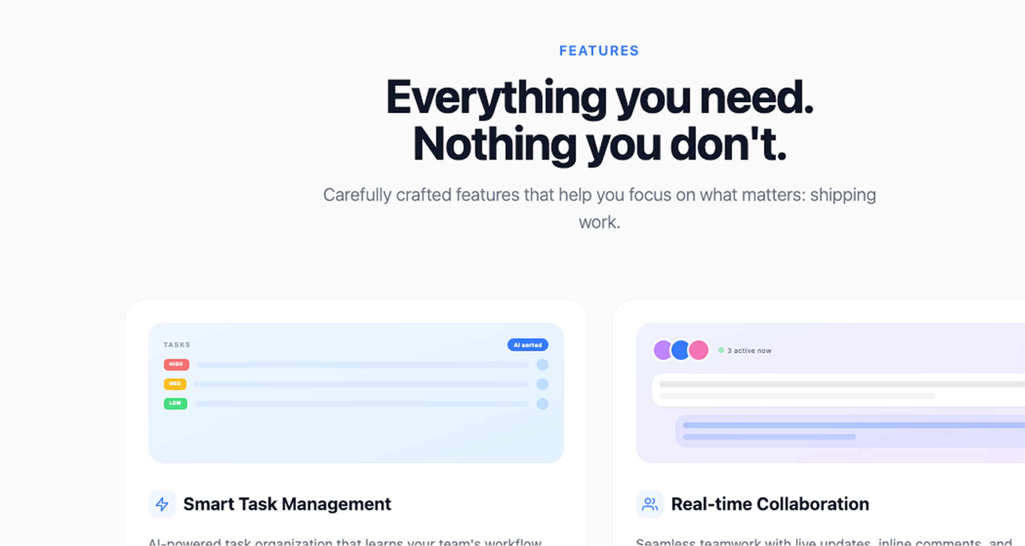
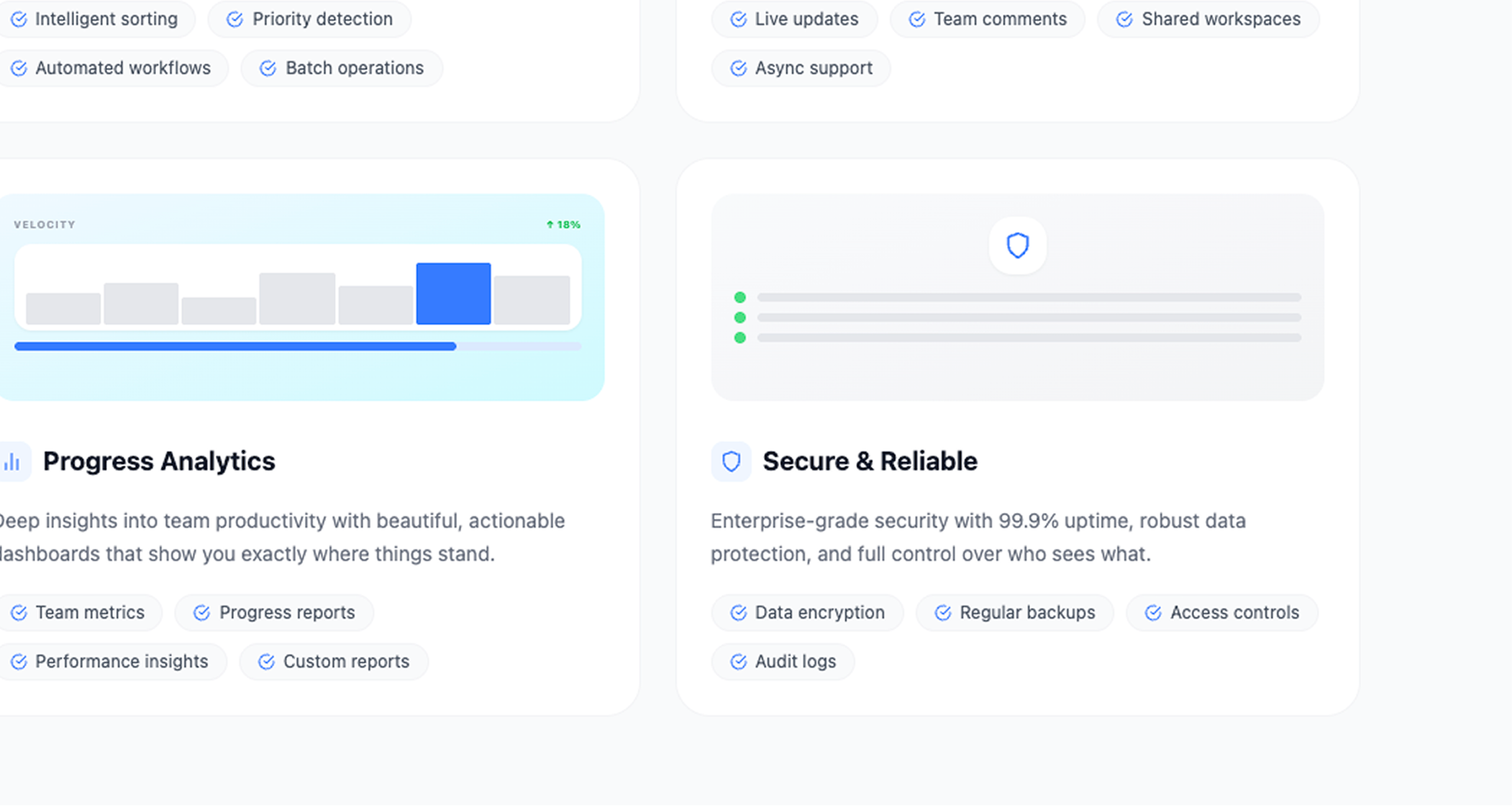
Design Process & Thinking
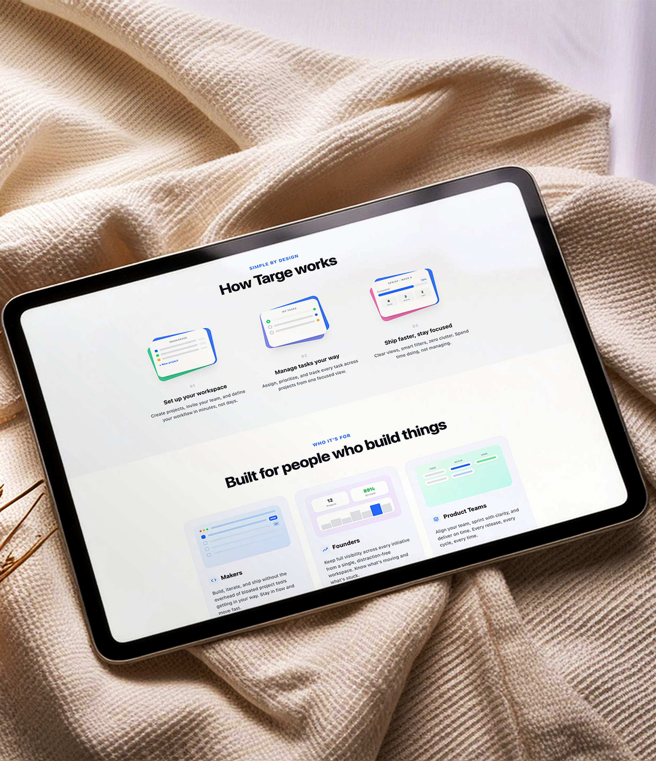
The design philosophy for Targe was built on one principle: zero unnecessary friction.
Every screen was interrogated with the same question - does this help the user move work forward, or does it slow them down? If it slowed them down, it was removed or rethought.
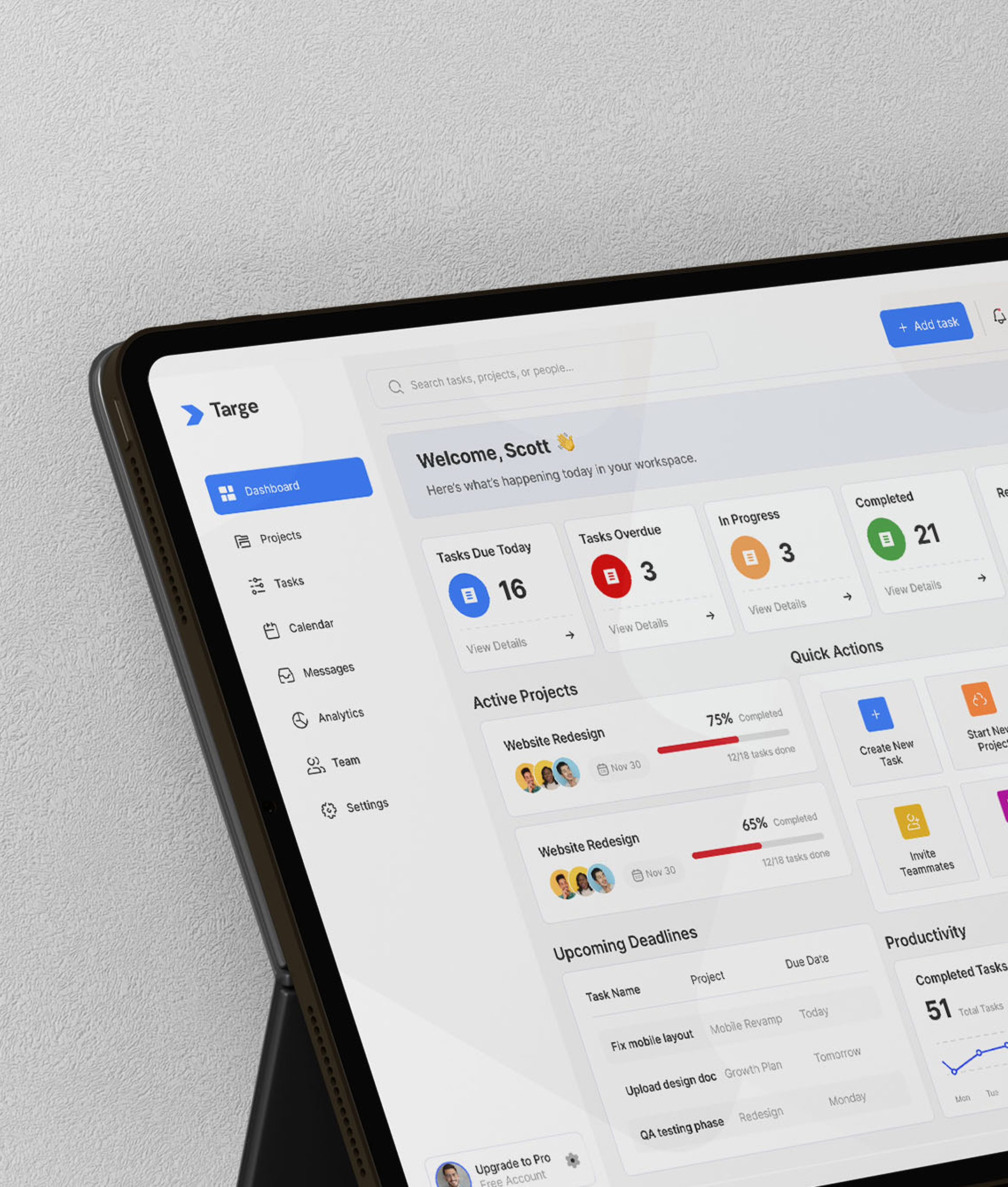
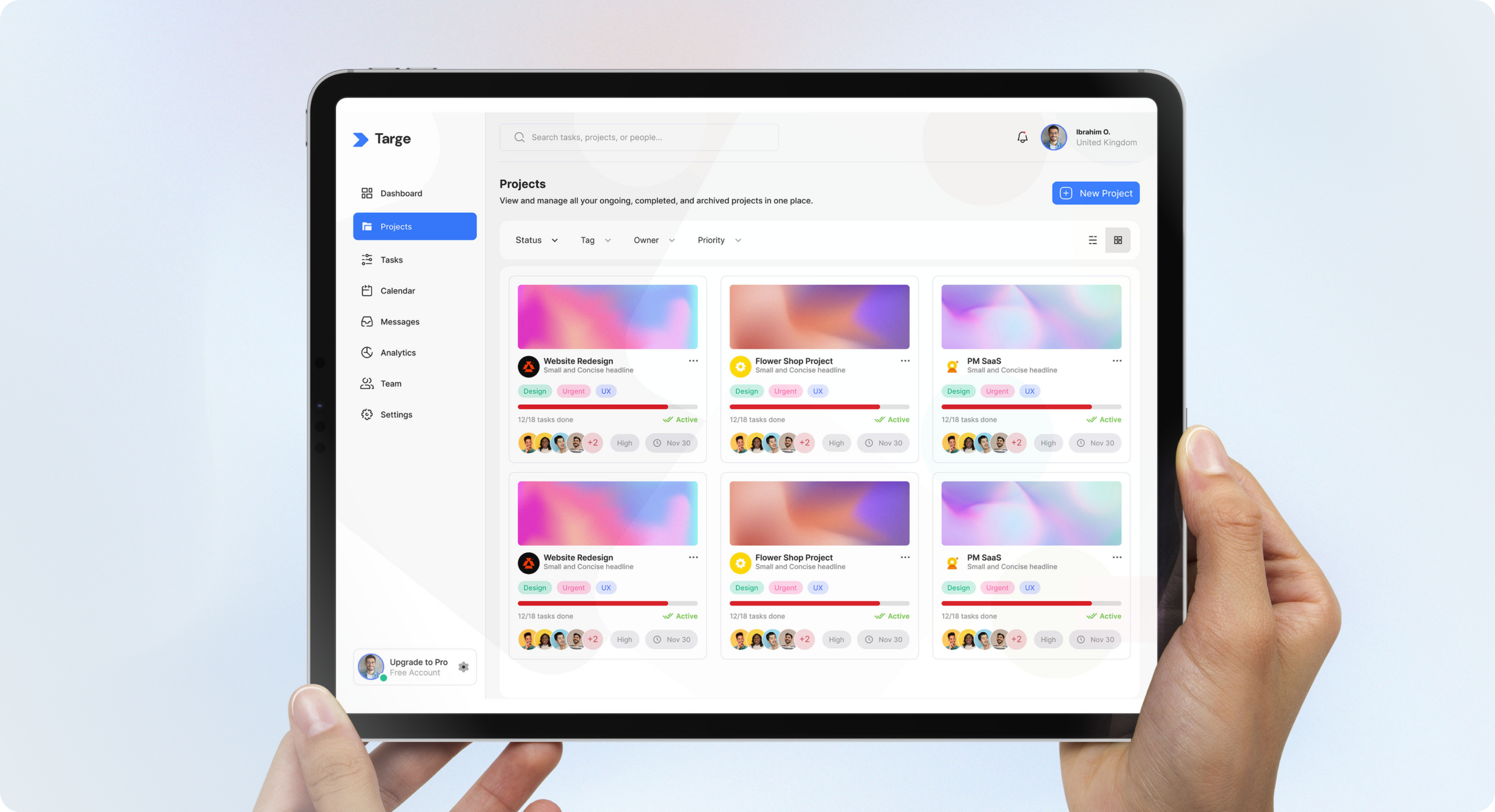
The dashboard was designed to answer four questions the moment a user logs in: what needs my attention today, what is overdue, what is in progress, and what have I completed. These became the four stat cards at the top of every dashboard - immediate, scannable, and actionable.
The sidebar navigation was kept deliberately minimal - Dashboard, Projects, Tasks, Calendar, Messages, Analytics, Team, Settings. No buried submenus. No nested hierarchies. Everything one click away.
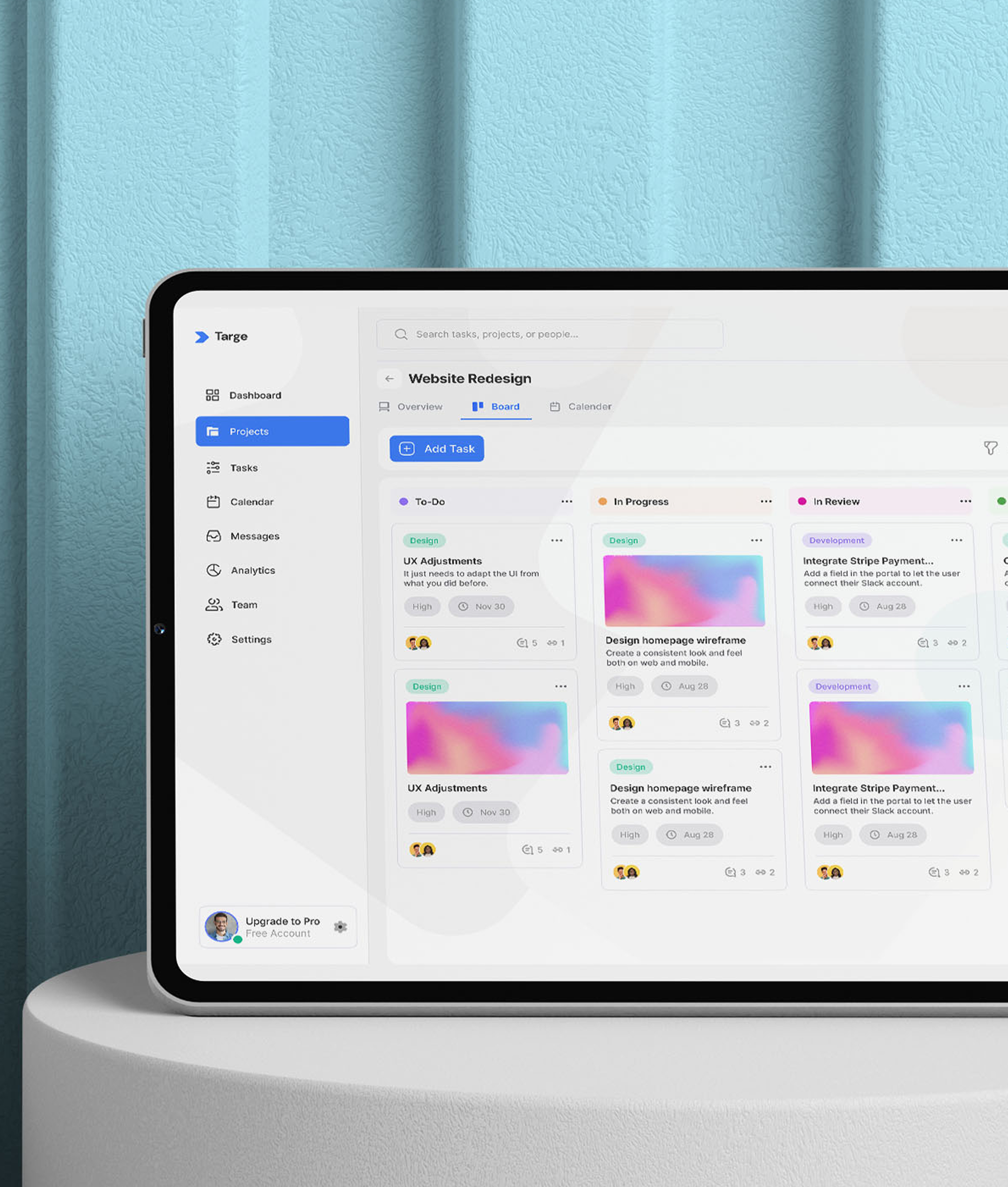
The Kanban board was designed with visual clarity as the priority. Columns are colour-coded by status; To-Do, In Progress, In Review, Done, so progress is readable at a glance without reading a single word. Task cards surface only what matters: title, priority, due date, assignees, and comment count.
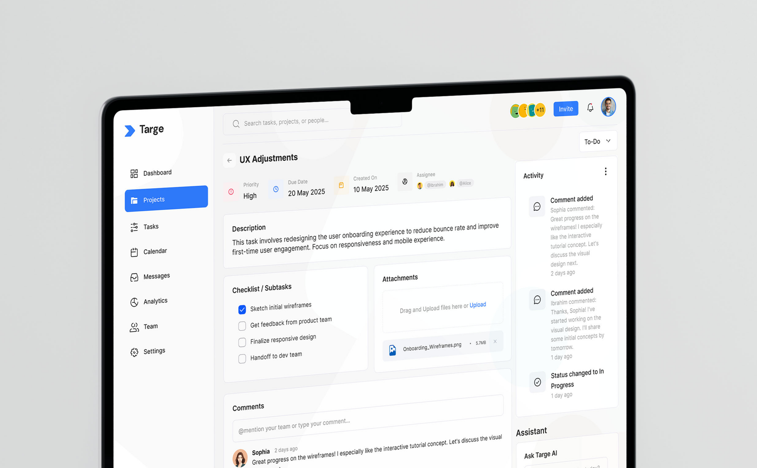
The Task Details modal was built to be the single source of truth for any task. Description, checklist, attachments, comments, and activity log all live in one place. No jumping between tools. No lost context.
The AI Assistant: Ask Targe AI was integrated directly into the dashboard and task view, allowing users to surface priorities and get recommendations without leaving their workflow.
Colour was used with intention throughout. Blue carried action and focus. Red signalled urgency. Orange flagged in-progress states. Green confirmed completion. The system works without explanation - users read the interface instinctively.
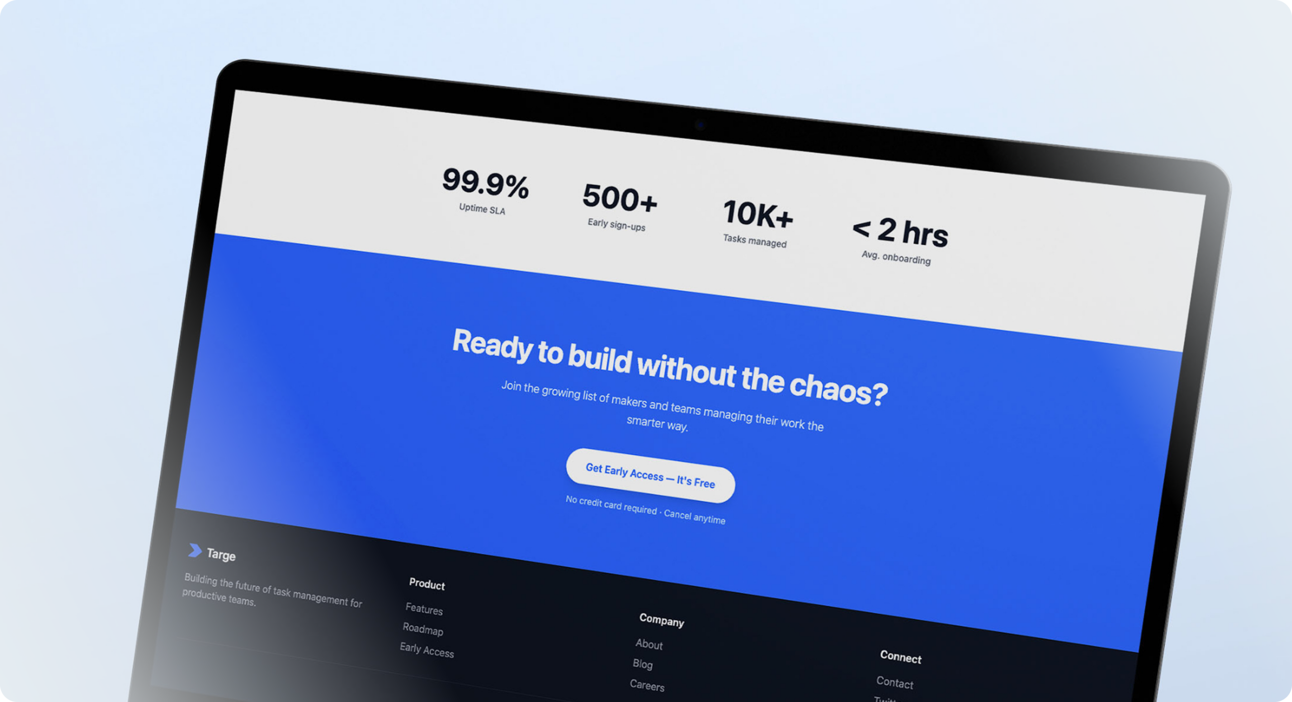
Targe launched into early access with strong initial traction. The waitlist model created anticipation and validated demand before full release. The product's clean interface and focused feature set resonated immediately with lean teams who had outgrown basic tools but found enterprise platforms too heavy.
A Series A startup needed a website fast without compromising on quality. We delivered a full custom prototype in 10 days, on time and on budget.
Read case study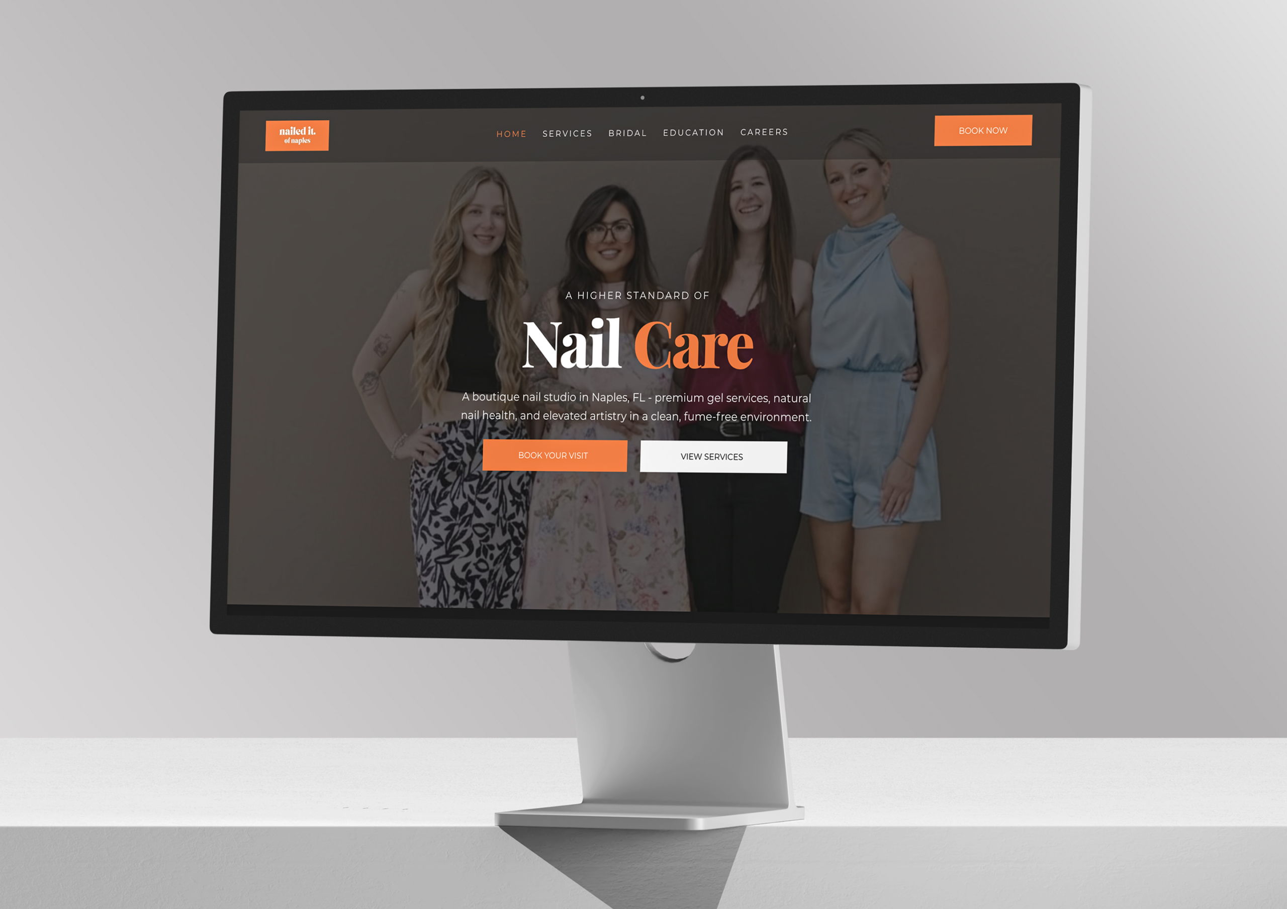
Nailed It of Naples is an award-winning boutique nail studio in Naples led by master technician Samantha Nguyen, and delivers exceptional, recognized craftsmanship but its digital presence lagged behind. Contrivea stepped in to create a refined, editorial, conversion-focused website that now reflects the studio’s true quality.
Read case studyTell us about your project and we'll send you a detailed proposal within 24 hours. No pressure, just a clear path forward.

 ✦ ✦
✦ ✦